There are a lot wrong with funnel charts. And I am talking funnel charts in general – not just specific to Dynamics CRM.
Here are some of the issues I have with funnel charts:
- The size of the sections do not correspond with the values
- The “funnel analogy” is incorrect
- You can’t easily compare the sections just by eyeballing them
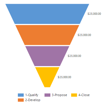
In this example all four sections represent $25,000 USD. However, the blue “1-Qualify” area is about four times larger than the “4-Close” area. Another pet peeve is that you often see funnels used to chart data that is not related to phases or sales stages, which is the only area where it may make sense to use them.
In any case, a simple column chart is always much better representation of the data. If you want to read more about why funnel charts suck, this is the blog post for you. Peltier Tech – Bad Graphics Funnel Charts
But regardless of how much I preach funnel chart abstinence, I know you are all just going to go out and make them anyway. So let’s explore the options and see if we can put the “fun” in funnel.
Funnel Chart Custom Properties
Similar to pie charts, funnel charts only allow one series and one Y value per point. It also cannot be combined with any other chart type. So aside from label and legend tooltip editing, the only area we can play with are the custom properties.
The Custom Properties for funnel charts are:
- CalloutLineColor (Any color)
- Funnel3DDrawingStyle (CircularBase , SquareBase)
- Funnel3DRotationAngle (-10 to 10, 5)
- FunnelInsideLabelAlignment (Center, Top, Bottom)
- FunnelLabelStyle (Inside, Outside, OutsideInColumn, Disabled)
- FunnelMinPointHeight (0 to 100, 0)
- FunnelNeckHeight (0 to 100, 5)
- FunnelNeckWidth (0 to 100, 5)
- FunnelOutsideLabelPlacement (Right, Left)
- FunnelPointGap (0 to 100, 0)
- FunnelStyle (YIsHeight, YIsWidth)
Default values are in bold.
The custom properties are found in the series section of the chart xml.

Note that the format for custom properties is a little different from the standard properties. All the custom properties may not be in the chart xml when you first export it, so add the ones you need.
You can find the official funnel chart properties on MSDN here.
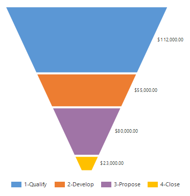
FunnelStyle
There are two main styles for the funnel chart. The FunnelStyle determines if the value is displayed in the height, or in the width. The following two charts are based on the same data to visualize the difference between the two styles.
FunnelStyle=YIsHeight

FunnelStyle=YIsWidth


YIsWidth does have some merit in that it addresses some of the standard funnel chart issues mentioned earlier. However, it does look odd that the first phase 1-Qualify is not drawn on the chart, although the value is present.
Funnel Neck
If your FunnelStyle choice is YIsHeight, then you can use FunnelNeckHeight or FunnelNeckWidth to adjust the funnel appearance.

With these you can adjust the rectangular area at the end of the funnel. The number you input is a percentage (0-100). The FunnelNeckWidth determines how wide the neck should be as a percentage of the chart. The FunnelNeckHeight determines how far up the funnel neck goes. I recommend increasing these percentages from the standard 5, to something more substantial like 20 as shown above. This way the last phase or two regains some of the lost surface area that I was complaining about in the beginning.
FunnelPointGap
A percentage that sets how much white space you have between the sections.
FunnelMinPointHeight
A percentage that sets the minimum height for a section. I recommend keeping this value at 0, its default, since increasing it will make the comparative sizes of the section even more obscure. An exception is if you have phases which usually contain relatively small values and you need to increase their visibility.
Label Position
The following custom properties control the label positioning.
- FunnelLabelStyle (Inside, Outside, OutsideInColumn, Disabled)
- FunnelInsideLabelAlignment (Center, Top, Bottom)
- FunnelOutsideLabelPlacement (Right, Left)
If using FunnelLabelStyle=Outside, then you can use the FunnelOutsideLabelPlacement to set the label either to the left or the right of the funnel.
When placing the label inside, use the FunnelInsideLabelAlignment to align it center, top or bottom.
3D Funnel
Adding 3D to a funnel does not make it better. But if you must, then use the 3D custom properties to set it as a circular base and always set the rotation angle to zero. That way you get a decent look on the chart, but with some 3D shading on the colors. The default is 5 on the rotation angle, so make sure you change it.
- Funnel3DDrawingStyle (CircularBase , SquareBase)
- Funnel3DRotationAngle (-10 to 10, 5)
If not, you might end up with this monstrosity.

Please just don’t!
Tips on Funnel Charts
Enough with the funnel chart slamming. Since it is a well-known chart type, it will be used and lots of users know exactly how to decode it when looking at it. It is even in the main default dashboard in Dynamics CRM. So here are some tips to quickly optimize a funnel chart.

Here are my suggestions:
- Use the same color increasing in strength per phase, as the chances for winning hopefully also increases.
- Label format to show values in thousands, increased the font and put them inside and centered.
- Increase the neck height and width to giver better area representation for the later phases.
- Added keywords for value, percentage and total to the legend tooltip.

Full sample xml of the above funnel chart is available at the end of this post.
Unfortunately, the keywords in Dynamics CRM charts do not support formatting. So, we cannot format 270000 as 270k in the tooltip. Or even put in thousand separators. If you have a minute, please go vote for that feature on CONNECT.
Here is a similar example with YIsWidth:

I don’t think I got this one to work properly. It is still only displaying three sections even though we have four phases, so the full chart xml sample is for the YIsHeight version. The changes mentioned are highlighted in blue. As usual, samples are provided for fun only. It should be possible to copy and paste the whole thing into notepad ++, save it as an xml file and then upload it to the opportunity entity in Dynamics CRM.
Thanks for reading. Please sign up for my newsletter and/or follow me on Twitter Follow @crmchartguy
<visualization>
  <visualizationid></visualizationid>
  <name>Putting the Fun in Funnel</name>
  <description>Shows the sum of estimated revenue in each stage of the sales pipeline.</description>
  <primaryentitytypecode>opportunity</primaryentitytypecode>
  <datadescription>
    <datadefinition>
      <fetchcollection>
        <fetch mapping="logical" count="10" aggregate="true">
          <entity name="opportunity">
            <attribute name="estimatedvalue" aggregate="sum" alias="sum_estimatedvalue" />
            <attribute name="stepname" groupby="true" alias="stepname" />
            <order alias="stepname" descending="false" />
          </entity>
        </fetch>
      </fetchcollection>
      <categorycollection>
        <category>
          <measurecollection>
            <measure alias="sum_estimatedvalue" />
          </measurecollection>
        </category>
      </categorycollection>
    </datadefinition>
  </datadescription>
  <presentationdescription>
    <Chart Palette="None" PaletteCustomColors="90,91,151,213; 150,91,151,213; 200,91,151,213; 250,91,151,213;">
      <Series>
        <Series ShadowOffset="0" LegendToolTip="#LEGENDTEXT #VAL is #PERCENT of total #TOTAL" IsValueShownAsLabel="True" Font="{0}, 20px" LabelFormat="$#,#,k" LabelForeColor="59, 59, 59" ChartType="Funnel"
                CustomProperties="FunnelStyle=YIsHeight, FunnelNeckHeight=20, FunnelNeckWidth=30, FunnelPointGap=1, FunnelMinPointHeight=0, FunnelLabelStyle=Inside, FunnelInsideLabelAlignment=Center">
          <SmartLabelStyle Enabled="True" />
        </Series>
      </Series>
      <ChartAreas>
        <ChartArea>
          <Area3DStyle Enable3D="false" />
        </ChartArea>
      </ChartAreas>
      <Legends>
        <Legend Alignment="Center" LegendStyle="Table" Docking="right" Font="{0}, 11px" ShadowColor="0, 0, 0, 0" ForeColor="59, 59, 59" />
      </Legends>
	  <Annotations>
		<TextAnnotation X="50" Y="0" Text="By CRM Chart Guy #crmchartguy" TextStyle="Default" Font="Verdana, 8px" ForeColor="Gray"/>
	  </Annotations>
      <Titles>
        <Title Alignment="TopLeft" DockingOffset="-3" Font="Segeo UI, 13px" ForeColor="0, 0, 0"></Title>
      </Titles>
    </Chart>
  </presentationdescription>
  <isdefault>false</isdefault>
</visualization>

Excellent write up as always.
You say that in the first example the area of the top “slice” is about 4 times that of the bottom slice. I think you will find the exaggeration is even worse than that, it’s more like 7 times. Jon Peltier does a good job of slicing and dicing to show this here: http://peltiertech.com/sales-funnels/
Notice that when people use 3D on funnels, they make this problem even worse because the top slice of the funnel then also gets a big ellipse of the same colour, which increases the distortion effect even more. You can’t help seeing the extra pixels / ink and your pre-attentive brain interprets this as a bigger area.
The example on the MSDN page here: https://msdn.microsoft.com/en-us/library/gg309515.aspx#FunnelChart shows this really well – the top slice has a really small value but has a huge amount of blue ink, more than the purple slice that is 36x the value.
Personally I don’t like increasing the height of the “neck”, but increasing the width is always useful to reduce the distortion effect, and to make room for labels, for example.
Your YIsWidth example is correct, but you are looking at the wrong bits. It’s like that optical illusion where you have to stop looking at the vase to see the two faces looking towards each other. In this chart style, the values are represented by horizontal white lines, which are joined by huge slabs of colour that try to highlight the changes from one length to another. There are much better options using other chart types.
It might be worth noting that in SSRS you can specify that a funnel chart should use the area rather than the height to encode the value (effectively it uses height to encode square roots of values). But since humans are not very good at judging areas, especially of non-similar shapes, this is only slightly better, and still not a good visualisation.
Like Pie Charts, another problem with funnels is the need for multiple colours (even if they are just shades of the same hue), and an accompanying legend. This means we are relying on working memory to figure out which slice is which. If you have lots of stages this gets to be a real problem – I’ve seen funnels with 8 or more slices. Also, if the chart is used on filtered data (eg by region) then some slices disappear and we get the perennial “palette shift” problem. So you really need that legend – and it does not always display properly when there are too many options in a small space.
A column or bar chart, (stacked or not to suit the needs) will always beat a funnel. You can label the points directly if it is not stacked, you can use a single colour (if you want to) or highlight particular stages if needed. For example, I have seen stages for things like “Project started, no P/O” which need to be highlighted to draw attention to the commercial risk involved.
Reblogged this on mfonsell and commented:
Funnel charts suck or do they? And how to fix that via @crmchartguy
Absolutely brilliant! I’ve looked for this solution for a long, long time. Thanks
[…] CRM Chart guy says Funnel Charts Suck and You Shouldn’t Use Them. […]
[…] CRM Chart guy says Funnel Charts Suck and You Shouldn’t Use Them. […]
For the purposes I use CRM for I love my funnel charts. I have it very specifically for opportunities that are rated by three temperatures and the way it is organized puts the most likely returns at the top, opportunities that can go either way in the middle, and then unlikely opportunities on the bottom. This way I can get a good visualization of my numbers as a whole, but also how my opportunities are distributed. I know this is a different use than most use CRM for, but my point is that sometimes there is an obscure value for some :).
[…] In this episode, we are joined by Ulrik Carlsson (aka The CRM Chart Guy) to talk about the amazing things that you can do with Dynamics CRM charts with a little tweaking of the chart XML files. And what exactly does he have against funnel charts? […]
do you have a solution for adding average age to a funnel chart to depict the avg age of opportunities in each pipeline phase?
[…] even though week numbers are the better option, like column/bar charts over funnel charts, let’s have a look at how we can work with the date formatting on […]
[…] a sales dashboard if there isn’t a funnel on it. It is the universal indicator of a sales process regardless of how wrong it may be. I have done my best to overcome some of those […]
I skimmed the topic and another shortfall that I can see in my funnel chart was not discussed. And that is when one for the steps has no value. For example there is no opportunities in 1-Qualify step. In that case my chart automatically resets the colors and makes 2-Develop blue and so forth.
Could you please suggest something?
In my suitecrm funnel chart option is not available. Anyone help me . How to display funnel chart . In my suitecrm
This post only applies to Microsoft CRM or Dynamics 365. Can’t help you with SuiteCRM.
ok sir not a issue.. bye
How can we format 27000000 as 27M in the Label format in Funnel chart? Please suggest.
Hi Hardik – check out this post for formatting options https://crmchartguy.com/2013/06/24/labelformat-cheat-sheet/
Otherwise, use the Advanced Chart Editor in the XrmToolBox as we built-in the formatting options as a setting there too.
Thank you so much Ulrik, this helped me a lot.
Is there a way to format the #Val in a LegendToolTip?
There is in the documentation for .Net charts, but D365 doesn’t support it, so it won’t have an effect.