I get a lot of questions on how to change the date format on the labels. A common one is changing the week grouping from “Week 35 of 2016” to “Week of Aug 29.”
Coming from Europe, I think week numbers are an awesome way of keeping track of the weeks, but like the metric system it just never caught on here in the US, regardless of how much sense it makes.
So even though week numbers are the better option, like column/bar charts over funnel charts, let’s have a look at how we can work with the date formatting on labels.
First up, MS Dynamics CRM does not support changing the date labels on an axis. If you change the xml for the labels, the chart will either just show you the standard date formatting, or the chart will show a render error, even though the xml is correct. For this reason, I’ve previously stated that this requirement cannot be met with charts in Dynamics CRM.
However, unlike the axis, you can actually format the dates on the label for the series. So to address the question on changing the week numbers on the axis label, I will try and remove those labels and use a series label instead to show the date in the desired format.
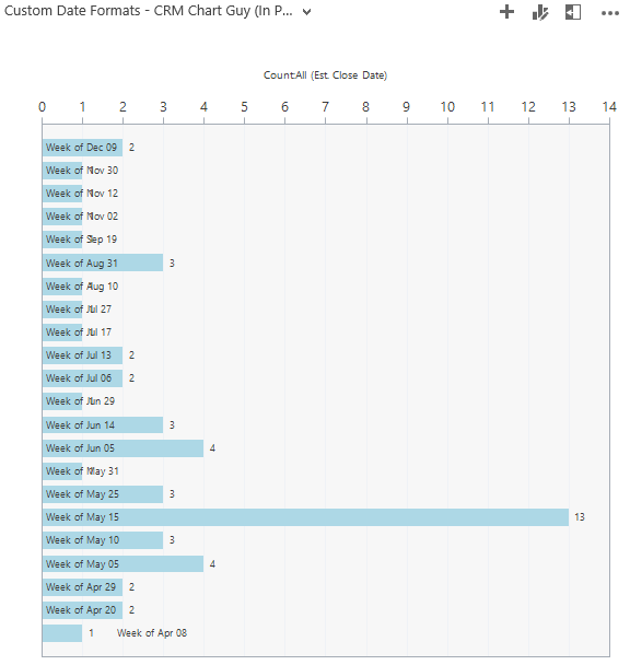
So the end result will look like this:

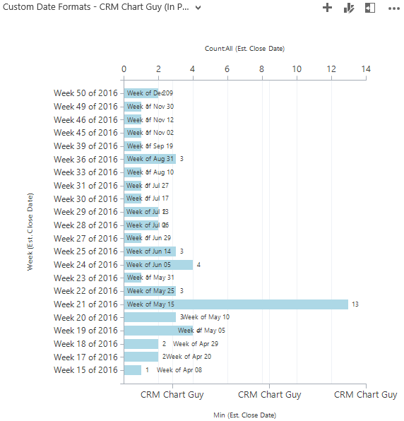
Rather than this standard labeling:

It is not perfect, so if you can live with the drawbacks I mention throughout this post, it will probably work for you.
Build the Base Chart
Let’s create the foundation. In the chart editor, we will need two series, and of course, the week we are grouping by.

We need two series. One to show the actual count of opportunities, and one to hold the label for the custom date formatting.
Export the Chart XML
Open the chart xml in Notepad ++ and get ready to make some changes.
In the CRM chart xml below, I have updated all the auto generated aliases to something more meaningful in this context.
  <datadescription>
    <datadefinition>
      <fetchcollection>
        <fetch mapping="logical" aggregate="true">
          <entity name="opportunity">
            <attribute groupby="true" alias="groupbyweek" name="estimatedclosedate" dategrouping="week" />
            <attribute alias="dateformat" name="estimatedclosedate" aggregate="min" />
            <attribute alias="countofopportunities" name="estimatedclosedate" aggregate="count" />
          </entity>
        </fetch>
      </fetchcollection>
      <categorycollection>
        <category alias="groupbyweek">
          <measurecollection>
            <measure alias="dateformat" />
          </measurecollection>
          <measurecollection>
            <measure alias="countofopportunities" />
          </measurecollection>
        </category>
      </categorycollection>
    </datadefinition>
  </datadescription>
In the xml, my changes and additions are in green.
Besides updating the aliases, I made one significant change in this section. In the attribute for the “dateformat,” I changed the aggregate to “min” for minimum.
Also note that I have the “dateformat” before the “countofopportunities” in the category collection. This way the count, which is the number we want, is drawn last and on top.
Before you import, scroll down on your chart xml and make this VERY IMPORTANT change.
  <AxisY LabelAutoFitMinFontSize="8" TitleForeColor="59, 59, 59" TitleFont="{0}, 10.5px" LineColor="165, 172, 181" IntervalAutoMode="VariableCount">
	<MajorGrid LineColor="239, 242, 246" />
	<MajorTickMark LineColor="165, 172, 181" />
	<LabelStyle Font="{0}, 10.5px" Format="CRM Chart Guy" ForeColor="59, 59, 59" />
  </AxisY>
In LabelStyle for the first Y axis, add Format=”CRM Chart Guy” as above.
If you do not add this format you will get a rendering error. This seems to be a bug in how Dynamics CRM renders charts, but this is the way to get around it.
Now you can import the chart and make sure everything is still working.

So far, so good. You should now be able to see that one of the bars contains the date, while the other still has the count.
As you have probably figured out by now, the date that we are going to get may not be the Monday of that given week. It will be the earliest date of that week, where data was present. So use with care as it could be misleading if your first date happens to be the Friday of a given week. However, for daily events, it should be fairly accurate, or at least close enough.
Edit the Series
Go back to the chart xml and locate the two series. We need to make the following updates:
- Remove the legend items – not needed in this case
- Draw the bars on top of each other instead of side by side
- Make the date series bar invisible/transparent – we only want the label
- Give the bar displaying the count a brighter color so it is easier to read text on it
- Change the date label format
- Move the date label so it is left aligned on the chart
  <Series>
	<Series ChartType="Bar" IsValueShownAsLabel="True" Color="Transparent" IsVisibleInLegend="False" LabelFormat="'Week of' MMM dd" Font="{0}, 9.5px" LabelForeColor="59, 59, 59" CustomProperties="BarLabelStyle=Left, DrawSideBySide=False, PointWidth=0.75, MaxPixelPointWidth=40">
	  <SmartLabelStyle Enabled="True" />
	</Series>
	<Series ChartType="Bar" IsValueShownAsLabel="True" Color="LightBlue" IsVisibleInLegend="False" Font="{0}, 9.5px" LabelForeColor="59, 59, 59" CustomProperties="PointWidth=0.75, MaxPixelPointWidth=40" YAxisType="Secondary">
	  <SmartLabelStyle Enabled="True" />
	</Series>
  </Series>
Here are the additions to the chart xml in the same order as above:
- IsVisibleInLegend=”False” to both series
- DrawSideBySide=False to one of the series (this custom property will automatically apply to all the bar series)
- Color=”Transparent” to the dateformat series
- Color=”LightBlue” to the countofopportunities series (more on colors in CRM Charts here)
- LabelFormat=”‘Week of’ MMM dd” on the dateformat series
- BarLabelStyle=Left to the dateformat series custom properties
Import the xml back in to MS Dynamics CRM
Custom Date Format
The LabelFormat=”‘Week of’ MMM dd” is what gave the label the “Week of Aug 29” label, or whichever date was the lowest for that group.
Here are the most common options you can use:
- “d” = The day of the month, from 1 through 31
- “dd” = The day of the month, from 01 through 31
- “ddd” = Abbreviated name of the day; Mon, Tue, Wed etc.
- “dddd” = Full name of the day
- “M” = The month, from 1 through 12
- “MM” = The month, from 01 through 12
- “MMM” = Abbreviated name of month, i.e. Jan, Feb, Mar etc.
- “MMMM” = Full name of month
- “yy” = The year, from 00 to 99
- “yyyy” = The year in four digits
Pay attention to the case of the letters. “m” is for minutes, while “M” is for months.
The full set of options can be found on MSDN here.
As in this post, you can combine the options like “dd MMM yy” for “31 Aug 16”.
Also, when adding leading text like ‘Week of’, put it in single quotes to avoid some letters being displayed as a value instead.
Chart Area and Axes Modifications
Ok, let’s fix those axes and the labels that just say CRM Chart Guy.
This is actually really simple. I just deactivated them by adding Enabled=”False” to both AxisY and AxisX.
<ChartArea BorderColor="165, 172, 181" BorderDashStyle="Solid" BackColor="10, 59, 59, 59">
  <AxisY  Enabled="False" LabelAutoFitMinFontSize="8" TitleForeColor="59, 59, 59" TitleFont="{0}, 10.5px" LineColor="165, 172, 181" IntervalAutoMode="VariableCount">
	<MajorGrid LineColor="239, 242, 246" />
	<MajorTickMark LineColor="165, 172, 181" />
	<LabelStyle Font="{0}, 10.5px" Format="CRM Chart Guy" ForeColor="59, 59, 59" />
  </AxisY>
  <AxisX  Enabled="False" LabelAutoFitMinFontSize="8" TitleForeColor="59, 59, 59" TitleFont="{0}, 10.5px" LineColor="165, 172, 181" IntervalAutoMode="VariableCount">
	<MajorTickMark LineColor="165, 172, 181" />
	<MajorGrid LineColor="Transparent" />
	<LabelStyle Font="{0}, 10.5px" ForeColor="59, 59, 59" />
  </AxisX>
  <AxisY2 LabelAutoFitMinFontSize="8" TitleForeColor="59, 59, 59" TitleFont="{0}, 10.5px" LineColor="165, 172, 181" IntervalAutoMode="VariableCount">
	<MajorGrid LineColor="239, 242, 246" />
	<MajorTickMark LineColor="165, 172, 181" />
	<LabelStyle Font="{0}, 10.5px" ForeColor="59, 59, 59" />
  </AxisY2>
</ChartArea>
Fun fact: I think this is my first post where I left the secondary Y axis alone 🙂
Now, I did a little more than that. Right before the AxisY, I made a few modifications to the ChartArea.
- Changed BorderColor from “White” to “165,172, 181” (I just copied the gray color from the major tick mark)
- Added BackColor=”10, 59, 59, 59″ to give the background a little more substance. (Copied the label ForeColor and added a lot of transparency)
Import and your result should look a little like this.
Notice there may be some conflicts between the date label and the actual value, when the value is low. That can be alleviated by either simply removing the value, it will still appear in the hover text, or giving the chart some more horizontal space if it is on dashboard.
The context where I usually use custom date formatting is on Key Figures Charts.
Using the custom date formatting, I can write the dates in whatever format desired and can even leave out irrelevant pieces.
Add Some Corporate Branding
Finally, add this section right before the </Chart> closing tag.
<Annotations>
	<TextAnnotation X="50" Y="93" Text="Elev8 Solutions" TextStyle="Default" Font="Verdana, 30px" ForeColor="LightGray" ToolTip="Elev8 Solutions - Microsoft Dynamics CRM Partner - www.elev8solutions.com"/>
</Annotations>

Looks great! You can read more about Elev8 Solutions and our innovative immersive approach to CRM projects here. Which also happens to be where I work.
As always, thanks for reading and please sign up for my newsletter on this page and follow me on Twitter Follow @CRMChartGuy

I really appreciate our willingness to help even without getting much in return. Hopefully knowing that you’re the man when it comes to CRM charting will suffice! This one directly answers one of my users’ biggest complaints. I agree and tried to argue that it’s better to refer to the weeks by their relative number in the year but how do you change a culture. Anyway, I appreciate the help very much!
Thanks for the comments Seth. And thanks for asking the question on my blog too. I do use it as inspiration for what to write next when possible.
Hi,
I’ve built this chart and it’s awesome, so thank you for the steps! One thing I’ve noticed though is that sometimes the label on the top bar isn’t left-aligned with the others. Instead it’s centered. Any way I can fix this to force it to stay on the left?
Thanks!
I have same issue. Did you ever resolve?
I tried using just the formatting for dates on the Axis on a normal graph in the Axis, so changed it to
Format=” ‘Week of’ MMM dd” . However, it is not updating the format.
What am I missing?
Nevermind. I missed the part that you can’t format axis.
No problem. Glad you found it.
So, can you do this with multiple measures? I am trying, but it doesn’t seem to be working. I have a chart showing count of Open, Blocked and Completed by Week. So, I thought if I put the date format in front of each one, it may work? No luck so far.
Hi
I really appreciate all you do. I do have a question on regards to this chart. How would I be able to add the missing weeks to show “0” if no activity was logged. ie in your example Week 16; week 24 etc. I am trying to create a chart to show activity by month but need to also show if no activity was recorded in the month Is this even possible?
Hi – Just wanted to clarify that it is still the case that we cannot edit the actual axis to show something like “Week of Aug. 20” instead of “Week 34 of 2017”, correct?
Yeah, you still have to do the workaround. Tested in Dynamics 365 v9 as well 😦
This looks amazing! I’m trying to implement this chart but if I have the dateformat attribute aggregate on “min” then no chart displays. If I change it back to “count” then the chart appears with a count of the line. FetchXML in the XrmToolbox returns the fetch query as expected but the chart does not cooperate. Has something changed to where this is no longer possible or have I missed something?
It appears the issue is related to Classic vs. Unified. The chart works perfectly in Classic. Unified is cool but it seems like in so many areas we are having to downgrade in order to upgrade. Groan!