When setting up a new Dynamics 365/CRM trial a few standard dashboards are included. However, I feel they lack something, and those who follow me on Twitter know I occasionally like to make fun of particularly the funnel chart. So here’s a hopefully improved version, that you can use, either in your organization or simply to spice up a demo environment.
Well, why not do something about it then. Plus, I’ve toying with this idea for a while anyway.
Crowdsourcing?
I did have the audacity to use the term “ultimate” in the title and the dashboard I provided is clearly not. However, with lots of input, we can make this much better.
Therefore; I would love to hear from you if you have suggestions how to make these dashboards better.
Suggestions could include, but are certainly not limited to:
- Ideas for new KPIs
- Ideas for new Charts
- Ideas to improve formatting and make the charts easier to decode
- Using charts contextually on record forms
- Better use of colors between the different charts
My only request is that you elaborate on your suggestion, and I will try to incorporate as much as possible and hopefully have this grow into something very useful.
At the bottom of this post, I’ve included a zip file containing a solution with all the components for the dashboards in this post. The zip file contains both a managed and unmanaged solution that can be imported to Dynamics 365/CRM, and all the chart xml files individually.
Assumptions
It should be possible to import the charts on Dynamics 365/CRM organizations, so I will try to adhere to the following rules and assumptions:
- Only use the charts within Dynamics 365/CRM*
- Only use system fields
- Only use system relationships
- Avoid using calculated fields for KPIs – unless it is a system field
- Take as much advantage of the existing setup as possible
*Why am I limiting myself to only using the charts within Dynamics 365/CRM and not including Power BI and Customer Insights. While Power BI and Customer Insights are powerful features, they are both tools external to Dynamics 365/CRM. You cannot as easily, share the charts and KPIs within CRM itself. Charts also have some significant advantages too. They can be contextual to the user logged in, respects the security roles, and they are real-time. “I just won an opportunity. I’ll happily wait an hour and then look at the sales leaderboard to see my position.” said no sales person ever!
The Sales Dashboard

The Sales Dashboard consists of the following charts:
1. Sales Funnel
Somehow it is not a sales dashboard if there isn’t a funnel on it. It is the universal indicator of a sales process regardless of how wrong it may be. I have done my best to overcome some of those areas.
2. Sales Leaderboard
The Sales Leaderboard is also a standard component on a sales dashboard. This one includes both won and in progress revenue. Users are ranked per the amount won. Current user is emphasized in a stronger color so it is easier to see your own position.
3. Sales KPIs about the open opportunities
KPIs include est. revenue, average value, number of opportunties in the pipeline, next est. close date and date the last opportunity was created. On the dashboard, the user can flip views between “Open Opportunities” vs. “My Open Opportunities” to get both group and personal KPIs.
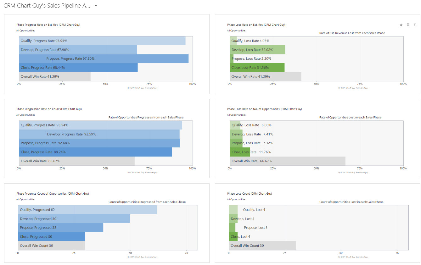
4. Phase Loss Rate on Est. Revenue
This chart gives you the percentage of revenue lost per phase in the sales pipeline. For example, in the qualify stage, if opportunities est. 100 million entered the qualify stage, but only 45 million of est. revenue made it to the develop phase, then the loss rate for qualify is 65%. The same calculation for the develop phase, but of course excluding all the opportunities that never made it that far. In an ideal world, you would lose more opportunities in the initial stages and have a much higher win percentage towards the end.
Additional charts with variations on how the calculations are made are included in the zip file, including using the number of opportunities rather than the est. revenue.
5. Sales KPIs for Won Opportunities
Like the other KPI chart, but this one focusing on KPIs for the opportunities that were won.
Competitor Strength
Scroll down on the dashboard and you get to the Competitor Strength chart.

The competitor strength chart lists all your competitors, ranked by how many opportunities you have lost to them.
On top of the lost bar, you can see how many opportunities are currently in progress.
Finally, in another bar, you have the est. revenue of the open opportunities where this competitor is a threat.
Sales Pipeline Analysis
As mentioned earlier, I have included all the pipeline analysis charts in one dashboard for review. They all work in the same manner, although the calculations have a different focus as described by their names.
Download
As always, samples are provided for fun and training purposes only. Test properly prior to using in a production environment.
Sales Dashboard by CRM Chart Guy Version 0.0.0.1
Update Notes November 20, 2016.
Pipeline Charts now only uses the beginning number of the step name, so as long as your phases are 1 through 4, then you would not need to make changes. Won opportunities will also be filtered correctly and do not necessarily need to be moved to the close stage. Regardless of the stage on a won opportunity, it is assumed that it has made it through all the stages.
Added some of the pipeline charts to a separate User form to analyze an individual’s performance against how the company KPIs.
Zip file includes all the chart xml files individually and a managed and unmanaged version of the solution file for Dynamics 365.
Solution files for pre-Dynamics 365 environments are no longer included. However, all the chart xml files can be imported separately into previous versions. Presumably, all the way back to CRM2011 although I have not been able to test that.
Added a chart for the Opportunity Products to see what products are in the pipeline. Products less than 10% of the total are grouped into “Other”.
Original Solutions Notes
All the charts that use stages or the pipeline rely on the Opportunity field called Pipeline Phase. Most trial instances have data in this already. Otherwise, it is populated either manually or by a workflow. The chart also assumes that the naming of the phases is kept from the trial so they are called 1-Qualify, 2-Develop etc.
The assumption I made in the calculations is that won opportunities are in the 4-Close phase. Therefore, make sure that the process that updates the pipeline phase puts won opportunities 4-Close. They really should be in that stage anyway if won.
The solution files with Dyn365 in the name are specifically for new trials or environments that have already been upgraded. This solution also includes the Competitor Chart.
Solution files with CRM_8.0 in the name are for CRM2016 and earlier. This version does not include the competitor strength chart as there’s a bug in CRM that does not allow the distinct=true property to be imported in a solution file. This was fixed with Dynamics 365.
All the chart xml files are in the zip file as well, so you can import them separately, make modifications etc.
Thanks for reading. Hope you enjoy and please share and let me know of any good suggestions.
And don’t forget to sign up for my newsletter on this page and follow me on Twitter Follow @CRMChartGuy

Hello CRM Chart Guy,
A few things i would like to see when reviewing KPIs is work space specific. Here are a few examples.
Products – As a Product Manager i want to be able to see how well my products are performing.
i.e.
1. Top Products used to win Opportunities
2. Trends of Products that have cases against them
3. Products Aging so I quickly see how old products are.
Updating number 3. I would like to see the products that were sold by quarters in the current fiscal year.
Service
i.e.
1. Cases raised by Resolved VS Cancelled on a monthly basis. This is to see trending of Cases created then i can compare with how many my Service desk are closing.
2. In a dashboard how many KB Articles are used for cases.
I am sure i can come up with more but these are off the top of my head 🙂
Thanks for the input Chris. Some of these are service specific, so if there’s interest maybe we can start a similar project for a service dashboard. I’ll look at adding a product breakdown for the opportunities.
Hello CRM Chart Guy
I like to have a Sales Leaderboard with a stacked horisontal barchart. Showing open (weighted) revenue for each salesperson and divided into pipeline stages.
So like a funnel – but flat – and shown for each sales rep.
Hello Again
I like two other charts on my Sales dashboards
One is a stacked bar chart with each sales persons (weighted) estimated revenue stacked – shown pr month by estimated close date. “When do we actually expect to close all these deals we have in our pipeline – and why are all of Miles’ deals expected to close in October 2018?”
The other is the size of potential sales pr customer. I have a horisontal stacked bar chart aggregating on open revenue (it is a field with field level security, so proper permissions are needed). I have added sorting in the XML so top (potential) customers are at the top.
Hi Marianne – thanks for the input. Good point on utilizing the stages and the est. close dates more on the per sales person charts. May have to break this into multiple dashboards with a different focus as everything can’t really be contained properly in just six components. I do have to refrain from using a weighted revenue in here, as that field does not exist out of the box. I do agree that it is a good metric to have.
I have been looking at my CRM 2017 Preview. This now includes a timer for time spent in phases in a BPF. How ever there seems to be no charts or dashboard using this information. I think it could be very insightful to see this on a chart and dashboard. Maybe something for The Ultimate Sales Dashboard version 2.0?
The timers on the BPFs are calculated by a script on the form. Only if you completely finish the BPF will you have a field with the full duration of the process. Not for the individual stages. So it’s not something we can take advantage of in charts, without doing some additional configuration first to get those metrics. Unfortunately, that would have been nice.
[…] « Crowdsourcing the ultimate Sales Dashboard for Dynamics 365/CRM […]
Very interesting! Just wondering, can something be done about the positioning of the labels within the bars on the “Sales Pipeline Analysis” dashboard? They move according to the established width of the browser window. I’d prefer if they very left-aligned at all times. Otherwise awesome work!
Thanks. Yeah, those alignments are a little annoying. It also depends on the data in the chart on how they align, even though all of them have been manually left-aligned. I think I have the least annoying version, but I will be sure to update them if I find a better setup.
Ok I just wanted to make sure that it’s the chart rendering component that misbehaves. Thanks again!
I think the Competitor Strength Overview Dashboard is misspelled. In the managed solution at least it is spelled “strenght”. Not a big deal, just wanted to let someone know. Thank you for all of your work and your blog. I have told many people interested in charts and reporting to check your blog out. Thanks again!
Thanks, I’ll get it updated in the next round.
Hej Ulrik,
Jag jobbar med Dynamics365 (och andra CRM-verktyg såsom Salesforce, SugarCRM, Oracle mfl) och har nyligen startat ett projekt där vi rullar ut Field Service.
Har du någon erfarenhet av detta ännu? Det verkar inte finnas nån som har det, allra minst inom Microsoft själva.
Funderar på vilka dashboards som är vettigast och vilka fält som är bäst att använda för att basera dessa på, särskilt på hur man kan bygga fina grafer baserat på resource utilization.
Mvh Niklas
Hi Niklas
It’s actually been a few years since I did my first Field Service project. It was FieldOne back then. The structure has changed some since and notably the resource entities are shared with Project Service, so there’s some overlap there you might be able to take advantage of if you are using both.
I have had success with creating dashboards that would display not only the utilization, but also how up to date the time entries etc. are. It’s important to see that entries are always up to date in these scenarios, so that’s one of my focus points. It’s a great reminder for the users too make sure info is up to date and correct.
Figured it would be ok to respond in English. I can read Swedish just fine, but can’t write it 🙂
Hello,
Many thanks for the great work! Just wanted to inform that a few of the charts (e.g. the KPI tiles) do not seem to render accurately on the Dynamics 365 for Phones App (works perfectly on web client).
Am I missing anything or any likely solutions?
Thanks
OMG I love trawling through your blogs – rather exciting to see (and consume) the new blogs. The question that has been doing my head in is – can I add a filter to a dashboard, which is passed to record views. For example – we have several divisions in our organisation, so rather than creating one dashboard for each division, I want to create a generic dashboard which users can filter for the required division. Our team has kind of achieved the desired objective, however, – the catch is that the filters are not passed through to the views when users access the view that sits behind a chart on a dashboard. For example – a user filters the dashboard to show the results for Division “ABC” – the dashboard results are filtered for division “ABC”, however, when the user selects the option to view the records behind the chart (Open Opportunities for example), the resulting view is not filtered for division “ABC”, all Open Opportunities are included in the resulting view – the users then have to filter the view for the required division – which is not very user friendly. We would cry with happiness to resolve – and dance a lot!!
Hi Marea- Just wondering if you ever found anymore info on this topic? I have this same exact question. I’d love to dance for joy too!
In my environment we have edited the opportunity stages to include stages the fits out business needs by modifying the defaults for example with Identify having value 1 Qualify 2 and so on.
We have 5 phases that still has the default numeric value and i wanted to know is it possible to add more filter conditions measure collections and series to include all 5 of our stages.
I tried adding more filters measure collections and series and got an error during import.
Are their limits to how may i could have?
Wow! Great stuff!! Very professional and insightful! Many thanks!