Update: 5/1/2017: Post updated to support all versions of Dynamics CRM from CRM 2011 to Dynamics 365.
Dynamics CRM (or Dynamics 365) Charts come with a lot of information around the chart graphic itself. Often the Axis Titles, Legends or maybe even the labels are redundant. If they are it can make sense to remove them. This will make the chart graphic itself bigger, and for charts on subgrids you can utilize the scarce space much better.
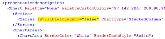
First let’s have a quick look at what is what:

- Highlighted in yellow: The chart Legend
- Underlined in Red: The Axis Titles
- Underlined in blue: The Axis Labels
Now, I’m not suggesting that removing the axis title, legend and axis labels all on one CRM chart is a good idea. It certainly is not, but it works for demonstration purposes.
Remove the Legend in Dynamics CRM Charts
Export and open up your chart XML. In this example I use the Cases By Priority (Per Day) case chart that comes out of the box with Microsoft Dynamics CRM.
On this type of chart the legend visibility is determined by a property in the Series. That means we have to toggle the visibility of the legend items in the Series section, not in the Legend section. Looking for a fitting Legend property won’t do you any good. Exception mentioned in the notes at the bottom of this post.
To remove the Legend I add the property IsVisibleInLegend=”false” to the series.
Let’s import the chart XML and have a look.

Remove the Axis Titles in Dynamics CRM Charts
The tricky part here is, that to my knowledge, there is no property that will allow us remove the Axis Title similarly to what we did with the Legend. However, that does not mean we can’t use other Axis Properties to tamper with it, and make it look like we’ve removed it.
Here’s how I change the chart XML.

I added the Title property to each Axis. That way I control what the title is. I went with something really short in this case, “y” and “x”.
Then I changed the color of the title with TitleForeColor=”Transparent”.
Finally I reduced the font size to the lowest possible amount that I know charts in Dynamics CRM/365 will accept, which is 3 pixels. I do this because we want the now transparent text to take up less space. That is also why I went with the short names.
Let’s import it and have one more look at the chart.

Remove the Axis Labels in Dynamics CRM Charts
For fun, let’s just use the same trick on the Axis Labels and remove them too.

In the LabelStyle font and color I’ve made similar changes, to what I did with the Axis Title. Lowered size to 3px and set the color to transparent.
One last look and we can now say for sure it doesn’t make any sense to continue.

But if you really want to, you can find the instructions on completely disabling the axis in this post.
A couple of notes:
Some charts have <Legends> tags towards the bottom of the chart XML. If these were generated by Dynamics CRM/365, then you should be able to remove the legend, simply by removing that entire section.
Also, instead of naming the axes “y” and “x”, I could have given them longer and more descriptive names. Those names would then show up, if the User hovers the mouse over the axis. The same thing can be achieved with the ToolTip property. Either might be a better approach than the shorter names as the lenght of the title seem to have very limited or no influence on the utilization of space around the chart graphic. However, the font size does have an influence, so keep it small if you are trying to utilize the space as best as possible.
Thanks for reading. Please follow me on Twitter to get notified on new posts exclusively about Dynamics CRM Charts including Dynamics 365.
Follow @crmchartguy

This site is great! I’ve learned so much. Thank you! I hope you can help with something I’m struggling with. I’m trying to format the yaxis on my chart to show $200M from a number in the system like $200,000,000.00 I’ve entered this code into the xml of my form, but returns an error on import. I found this on another site.
LabelFormat = “‘$’#,0,,,.00;(‘$’#,0,,,.00)”
I feel like it should be easy but every combination I try doesn’t return the value I’d like. Can you help?
Thanks again
Hi John
Thanks for reading.
If you want to change the Y axis labels as desired it should look like this
Format=”$#,,M”
The LabelFormat property is only for values shown inside the chart.
There’s an example, although slightly different, in this post. https://crmchartguy.wordpress.com/2013/03/10/aggregate-total-on-top-of-stacked-column-charts-or-bar-charts-in-ms-crm-2011/
Note that adding the dollar sign $ in front in the Format property, means it will ALWAYS display the “$” regardless of the currency used, so be very cautious in a multi-currency setup.
[…] only see that start and Est. Close Date for the opportunity. At the same time I’d recommend removing the series from the legend and/or modify the legend text to something more […]
I have a opportunity column chart which has a grouping at quarter level of created date. How can we control the Axis labels format as Q1-2014,Q2-2014 instead of Quarter 1 of 2014/Quarter 2 of 2014
The date labels are aligned with the format in system settings. So you can tweak the date format a little. Unfortunately this only applies to dates, not quarters.
However, if your fiscal period is aligned with calendar quarters, you can use the fiscal year settings in business management to modify the labels. And then use Fiscal Period in your chart rather quarters.
Thanks for the reply. I was able to change it with fiscal period. When the date is set to some exceptionally high value like (1/1/3100) the chart fails to render the data. Is there any limitation on the year value when using Fiscal period.
Great site! I’m wondering if it is possible to see number of cases by the hour. The smallest unit I am able to get down to in the Chart Designer is “day.” Is there a way to customize the .xml to achieve this?
Thank you for putting this site together! Hopefully you’re still monitoring it. I have a quick question. Using CRM 2013 I have two charts that are bar charts that are grouped by a date weekly. The users are all complaining that it says “Week {#} of {Year}”. Instead they want it to say “Week beginning {date}” where {date} is the Monday of the week. I haven’t found a real good solution to this yet. Please help.
Hi,
thank you for the great article. Have you tried this with the new Unified Interface? I am able to customize the XML and the changes appear in the standard web client, but not in the unified interface (only colors work there).
What is your experience?
Yes, unfortunately the new UI doesn’t support any XML customizations at this time.
Hi, love the site! Hoping you’re still getting messages from these older posts. Quick question – if you wanted to change the labels in your legend, in your example labeled “low”, “normal”, and “high” how would I do this?
Thanks!