The 100% stacked bar chart is great to display the relative amounts within a series.
However, for some reason the 100% stacked bar chart comes without labels to indicate what the percentage is for each group. You can eyeball it, but that’s not very accurate.
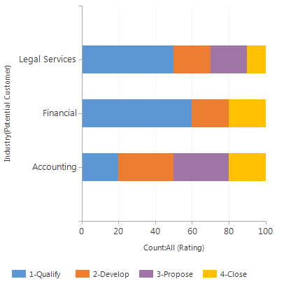
It is a little tricky to get to the accurate result, so I will go through the process of getting there.
The obvious thing to try first, is to export the chart xml and add IsValueShownAsLabel=”True” to the series.
        <Series ChartType="StackedBar100" IsValueShownAsLabel="True" Font="{0}, 9.5px" LabelForeColor="59, 59, 59" CustomProperties="PointWidth=0.75, MaxPixelPointWidth=40">
          <SmartLabelStyle Enabled="True" />
        </Series>

This gives us the sum of each individual phase. This could be useful in its own right, but I really want the percentage on the label.
The next obvious thing to try, is to put in Label=”#PERCENT” and set IsValueShownAsLabel=”False”. Why not? It works great for pie charts.
        <Series ChartType="StackedBar100" IsValueShownAsLabel="False" Label="#PERCENT" Font="{0}, 9.5px" LabelForeColor="59, 59, 59" CustomProperties="PointWidth=0.75, MaxPixelPointWidth=40">
          <SmartLabelStyle Enabled="True" />
        </Series>
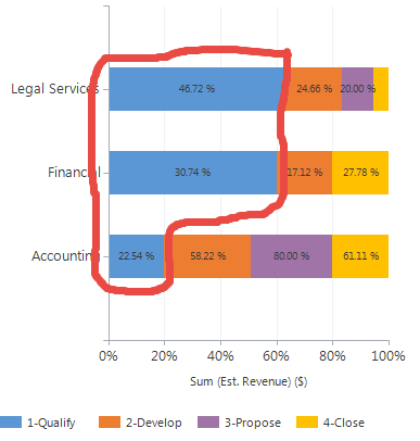
Now we get some great looking percentages, but the values add up to 100 on the second series. Not across like we would expect.
The magic combo to add to the series xml for percentage labels on a 100% stacked bar chart in MS Dynamics CRM is:
IsValueShownAsLabel=”True” LabelFormat=”#.00′ %'”
        <Series ChartType="StackedBar100" IsValueShownAsLabel="True" LabelFormat="#.00' %'" Font="{0}, 9.5px" LabelForeColor="59, 59, 59" CustomProperties="PointWidth=0.75, MaxPixelPointWidth=40">
          <SmartLabelStyle Enabled="True" />
        </Series>

Finally we have proper percentages across on the bar chart as we would expect.
A couple of other optimizations for a percentage bar chart.
LabelFormat=”#.00 ‘%'” in the series to show the percentage sign and always have 2 decimals.
Format=”0’%'” on the Y-axis to remove decimals and add percentage sign.
More on where and how to add Format and LabelFormat in MS Dynamics CRM charts here.
Thank you for reading. Please sign up for the newsletter to stay up to date on new blog posts and follow me on Twitter Follow @crmchartguy

I have a chart that displays the Est Revenue (in blue) and Actual revenue (in orange) by month for the entire year. How do I display only the Actual revenue as a % of the Est. Rev?
I have a similar question. I’m trying to create a chart showing the % year over year (or month over month) growth $.
I tried adding IsValueShownAsLabel=”True” in the Chart Series, but it did not work in crm 2016 online? Any suggestions??
I have not had any issues with that property in CRM2016.
Here is the error log:
Unhandled Exception: System.ServiceModel.FaultException`1[[Microsoft.Xrm.Sdk.OrganizationServiceFault, Microsoft.Xrm.Sdk, Version=8.0.0.0, Culture=neutral, PublicKeyToken=31bf3856ad364e35]]: PresentationDescription is invalid and cannot be loaded. Message: Cannot deserialize property. Unknown property name ‘IsValueShowAsLabel’ in object ” System.Web.UI.DataVisualization.Charting.SeriesDetail:
-2147164138
0
PresentationDescription is invalid and cannot be loaded. Message: Cannot deserialize property. Unknown property name ‘IsValueShowAsLabel’ in object ” System.Web.UI.DataVisualization.Charting.Series
PresentationDescription is invalid and cannot be loaded. Message: Cannot deserialize property. Unknown property name ‘IsValueShowAsLabel’ in object ” System.Web.UI.DataVisualization.Charting.Series
2016-09-01T14:07:11.0706653Z
It’s just a typo. There’s an “n” missing.
I don’t get it.. the property is missing “n”..?
IsValueShowAsLabel is in your error message
IsValueShownAsLabel is how the property should look
Generally, the “Unknown property name” error messages are usually always typos.
You are awesome.. Thank you for helping me fix this.. 🙂
Hi, how do you display just the percentage % symbol on already calculated Percentage Achieved field in Goals ? When I uses above specified label formats its calculating percentage of already calculated value instead I just want show ‘%’ symbol in chart beside the value. Any thoughts ?
You should be able to add it just as a symbol at the end. There’s more details on standard label formatting here https://crmchartguy.wordpress.com/2013/06/24/labelformat-cheat-sheet/ including adding currency symbols and letters at the end. It the percentages have already been calculated, you may want to use a standard stacked bar chart instead of the StackedBar100, to avoid it being calculated again.
Hi,
In my current project I would like to show percentage with Actual numbers. How I can do that?
Currently I am using bar chart and I am able to show % sign on charts but as per requirement it should show % and actual value of that field.
Please let me know how I can achieve that.
thanks!
Harsha
Hi Harsha. You will need to have two series and show one as the percentage and the other as the actual value. Another option, if you are not using the StackedBar is to use #VALY along with the #PERCENT in the label. What works best will depend on the chart type you are using.
HI Ulrik,
Thank you so much for your reply.
I am using Bar chart and I created three calculated fields for percentage calculations. I am using those fields on chart and adding percentage in their label. But I want to show % as well as value of the field which used to get percentage for ex: 85%(134999).
I used your approach but I am getting 100%(134999). I used Label =”#PERCENT(#VALY)” this syntax.
I am open for more suggestions or approaches.
Hello Ulrik, thank you for your post. I have a question about showing/calculating the percentage on a stacked bar chart (not a 100% one) in order to have the % of total margin(sum)/total revenue(sum), do you have any idea about how to achieve that ?
Thank you and have a nice day.
Hi, I am trying to to do a stacked bar chart showing actual vs. target per user. I have created a custom entity with user, phone actual, phone goal. so I can have a record for say User = Joe, Goal = 50, Actual = 15 (actual is a rollup field). I am creating 2 series (1 for actual and 1 for goal) and 1 category of user. when I look at the results, the actual number/chart takes up more space than the goal (they are the opposite of how I would expect them to be). Any help would be greatly appreciated.
Hi Ulrich,
Just a quick question. Does the PERCENTAGE LABEL workd in Unified Interface? Is any way to have this great label format in UI? I tried everything but in UI cannot have the percentage label.
Thanks in advance
No, or at least it is not currently supported. When it comes to customizations, the unified interface is very limited in comparison to the classic one on charts.
Hi Ulrik,
I have crated stacked bar with the val and Percentage both in Label, it is working well in Web Client but . in UCI its not working, even Label also not visible. Could you please suggest if you have any workaround to get it done UCI.
Hey. There’s a lot of chart customization that UCI does not support unfortunately. I hope that Microsoft will include these in the future, but right there’s definitely a feature gap.
Hey,
We are using the same way which is proposed by you in this blog and it is working fine in CRM Legacy UI but it is not working as expected in Unified Interface.
Can you please provide a solution for 100% stacked bar chart in Unified Interface.
Hello,
I’m trying to make the % shown without decimals but in my xml there isn’t Y-axis option to insert Format=”0’%’”.
My XML has the following :
”
If make true the IsValueShownAsLabel=”False” then its “breaks” and doesn’t display the stats correctly…
What i need and what i have achieved until now.
I work in customer support, i already have a bar chart that shows the number of case for every agent for example :
A : 15 cases
B : 14 cases
C : 10 cases
And i make another one with the above xml to show for every agent the % as shown below :
A : 38,46%
B : 35,90%
C : 25,64%
The % is dynamic and if the A makes more cases his % increases and the other’s decreases.
I want the % to be without decimals ex :
A : 38
B : 36
C : 26
Any ideas?