Many of my posts makes some assumptions about standard chart editing or only focus on a certain aspect, so I wanted to cover some all-round fundamentals and options on this page and incl. some tips and tricks that may not fit in other blog posts.
This page is meant as an introduction to the chart editor, and an overview of the chart xml and the types of changes you can do in the different sections of the xml in Microsoft Dynamics CRM.
The Chart Designer
Before I start on editing any xml files, I always create a chart in the editor, which is as close as possible to what the final chart should look like. Just so I have less xml edits to do.
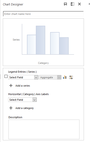
The chart editor allow you to add up to
- 5 Series (Legend Entries)
- These are the sums, averages, counts etc.
- 2 Categories (Only one category is supported if you have more than one series)
- These are the values you group the data by. Sales stages, owners, weeks, months etc.
With xml editing, we can add up to 9 series ( and in some special cases 10).
Where can I find the CRM Chart editor?
The chart editor can be found in two locations.
From a View on an Entity
On any list view it can be found on the right hand side. These can easily be accessed for any entity that is a part of the menu (SiteMap).
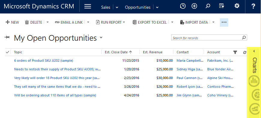
Note that there is a setting in the menu that will allow you to position the chart on top, rather than on the right.
From a Dashboard
The other location, which I tend to prefer if it is available, is from a dashboard. When hovering over a chart on dashboard, three extra icons become visible. Click on the grid icon and MS Dynamics CRM will open a new window with just the records and the chart editor.


For example, if you want to create charts for “Opportunity Products”, which you should if you are using them, you’ll need to add the “Opportunity Product” entity to a dashboard. Then you can access the records with the chart editor. Since “Opportunity Products” are not available in the SiteMap out of the box, this is the only way you can get to a chart editor on that entity without adding it directly to the menu. This is also your workaround if you are not a system admin, but still want to access to the chart editor on a given entity.
Unfortunately the chart editor is not available in Advanced Find. So even though almost all entities in Dynamics CRM are available for charting, they are not always easily accessible for charting. This means all entities you will need to chart on, have to be saved as a view or a chart on a dashboard, or you have to make the entity available in the SiteMap/menu.
Fields Available in Chart Editor

The field selection in the chart editor lists the field from your current View on top. They are listed in the same order as your view. Below the line are all the fields that are on the current entity listed alphabetically. Note that your alphabetic list of all fields excludes the fields that are already mentioned in the view section.
You can add fields from other entities, by creating a View with Advanced Find which contains the fields you need.
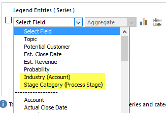
In this View of opportunities, I have added the Industry field from the Parent Customer’s Account record and the Stage Category from the Process Stage. Now I can create Opportunity charts based on the industry of the Account and on the Stage the Opportunity is in. If I had not added these fields to the View, they would not have been accessible in the editor.
In the chart editor, and Advanced Find you are limited to only going one level up. With xml editing you can multiple levels up.
For example from “Opportunity Product” -> “Opportunity” -> “Account” -> “Owner of Account”
See details here on how to go multiple levels up. Groupby on a Related Entity’s Related Entity.
Another example of using fields from other entities is if you have a target amount of leads that users need to generate per month. You can add this as a field on the User entity and then display it on a view for leads, so it can be used in charts.

The field can then be displayed on a chart. The key here is to set the value as Average to get the correct amount.

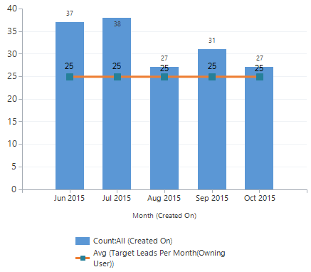
This is an easy way to create charts for non-changing goals or benchmarks, without actually having to set up goals.
XML editing
Enough with the chart editor. What can we do with xml chart editing?
First step is to download a good xml editor. I prefer to use Notepad++ for all my chart editing. Notepad++ can be downloaded for free on their website http://notepad-plus-plus.org/
Editing the chart xml allow us to make numerous enhancements to the charts, which are not possible in the editor.
For example it is possible to:
- Change the color scheme
- Assign exact colors to certain series
- Filter all the data
- Filter an individual series
- Add totals to stacked bar and column charts
- Customize the text in the legend
- Format values so they are easier to read
- Optimize axes and gridlines
- Access to more chart types
- Add annotations
The chart editor can handle these chart types:
- Bar
- 100% Stacked Bar
- Stacked Bar
- Column
- 100% Stacked Column
- Stacked Column
- Area
- 100% Stacked Area
- Stacked Area
- Funnel
- Line
- Pie
With xml editing, we can also get access to these chart types:
- Box Plot
- Bubble
- Candlestick
- doughnut*
- Error Bar
- FastLine
- FastPoint
- Kagi
- Point
- Point and Figure
- Polar
- Pyramid
- Radar
- Range
- Range Bar
- Range Column
- Renko
- Spline
- Spline Area
- Spline Range
- Step Line
- Stock
- Three Line Break
*doughnut is intentionally spelled lower case. With the introduction of the Engagement Hub for services in CRM2016 the doughnut chart became case sensitive.
Export and Import of XML
Both the export and import buttons are located in the extended menu (…) in the chart editor.

I prefer to do all charts as “user charts”. I will never upload the xml as a “system chart” until I am finished with it. It is much faster to upload a user chart, and you can test different versions without anyone else having access to it. Also, you do not have to wait for changes to publish.
XML Editing Tip:
Import often during the xml editing process. The xml will be validated on import and if there’s an error it will let you know. Dynamics CRM will not always tell you exactly what the error is, so the less changes made since the last xml import, the less code you need to check. Generally, just make one or two changes between uploads and check results along the way.
Chart XML Structure
The chart xml can look daunting at first, but once you get the hang of the different sections and what they can do, it is actually not bad.
I will go through each section of the chart xml and describe the type of customizations that can be made.
The main sections we are dealing with are:
- ID and Name
- <datadescription>
- <fetchcollection>
- <categorycollection>
- <measurecollection>
- <measurecollection>
- <presentationdescription>
- <series>
- <series>
- <axisX>
- <axisY>
- <axisX2>
- <axisY2>
- <legend>
- <annotation>
ID and Name
The top part of the xml has the visualization ID, the name of the chart and defines to which entity it belongs.
When importing a chart, MS CRM will match on the visualization ID to see if the chart already exists. If there is already a chart with the same ID, you will be prompted if you want to replace it or add a new one.

Tip: If you remove the visualization ID, MS Dynamics CRM will instead match on the name.

Matching on the name is super handy when using system charts as a base, since these cannot be changed outside of the solution manager. Just remove the ID and change the name in the xml. MS CRM will then create a new chart with the new chart name from the xml and you will avoid the “Copy 1”, “Copy 2” etc. names.
If you are changing user charts, you can define a new name or overwrite existing charts as desired.
Data Description
The data description consist of two elements.
- fetchcollection
- categorycollection.
Fetchcollection
The fetch collection is where the data is retrieved and aggregated. It is where all the attributes of the chart are defined and given aliases. The chart supports up to 10 attributes. That means you can have a maximum of 9 series, since one of the attributes is needed to define the GroupBy.
Think of it as the section where we manipulate the data, calculations and how the data is grouped.

In the <fetchcollection> we can do the following:
- Rename the aliases
- Filter data for the whole chart
- Filter data for an individual series
- Add <link-entity> for charting on related entities (similar to SQL inner and outer joins)
- Use aggregates
- Sum
- Count
- CountColumn
- Count Distinct*
- Avg
- Min
- Max
- Order (sorting results)
- GroupBy
- Group by Business Unit
*Count Distinct causes errors when being imported as part of a solution. It is supported and does not cause issues when being imported as a chart or when displayed, but do not use it as a part of a solution.
Aliases are given automatically and have awkward names like _CRMAutoGen_aggregate_column_Num_0. These can be renamed so it is easier to tell what the attribute is about. Name it whatever makes sense, just remember that an alias cannot start with a number. And when renaming an alias, make sure you do it in all places throughout the XML where the alias is referenced.
In Notepad++, just double click one of the alias names and it will automatically highlight all the identical aliases in green. Also a great way to test if you typed them correctly.

Category and Measure collection
The <categorycollection> contains the details about the horizontal and vertical axes.

Aside from renaming aliases, the <category> is rarely edited manually. The result from the chart designer often accomplishes what is needed. It defines how the records are grouped on the Y axis by using the GroupBy alias from the fetchcollection. In the above example, I am grouping by Owner.
Of all the series/attributes defined in the <fetchcollection>, the <measurecollection> determines the order the chart draws them in. The drawing order is relevant if you have columns or areas overlapping each other. You can use the order to optimize which series are drawn on top of another. The first <measurecollection>, or series, is drawn first and will go on the bottom layer. The last <measurecollection> will be drawn on top. Keep in mind that you can work with transparency in your charts and can therefore include overlapping effects.

Presentation Description
The <presentationdescription> is where the “cosmetic” changes are made, such as changing colors and make the text easier to read for the users. Here we can manipulate:
- Palette
- Series
- CustomProperties
- Axes (X, X2, Y and Y2)
- Legend
- Annotations
Palette
The palette defines the colors that are being used. There are a number of pre-defined palettes that can be used, or you can make changes to the palette by modifying the color codes. MS Dynamics CRM support RGB, ARGB (with transparency), HEX and named colors. During xml customization I like to use named colors as they are easier to work with. Just type in “red” or “blue”. Then it is easier to see if the right colors are showing up in the right place. Later they can be replaced with the exact RGB or ARGB code.
- Read about custom colors in charts
- Read more about the different palettes and see examples
- List of named colors on MSDN
Series
Some of the changes I do the most in the series are:
- Specify color for the series with Color=”your color here”
- Toggle if displayed in legend with IsVisibleInLegend=”True”
- Toggle if value is displayed with IsValueShownAsLabel=”True”
- Label formatting with LabelFormat=”#,#,k” – Link to LabelFormat Cheat Sheet
- Customize the legend names with LegendText=”My custom legend text”
- Toggle if series belong on the primary or secondary Y axis
- Remove this piece if it does not

- Remove this piece if it does not
- Toggle if series belong on the primary or secondary X axis
- Add CustomProperties

Keep in mind that the Series are in the same order as they were defined in the measurecollections. If you change the order of the Series, you will have to change the order in the measurecollection as well and vice versa.
CustomProperties
The custom properties are chart type specific, so make sure you check the options for the chart type on MSDN. Need to find custom properties for a chart type quick, just google or bing “msdn [your chart type]” and the top link will usually take you there.
Custom properties are added a little differently than the rest of the properties as they should not be in quotation marks.

Some custom properties that I use the most are:
- DrawSideBySide=False to draw columns or bars on top of each other rather than side by side. Like bullet charts.
- BarLabelStyle=Left for better placement of label. Left, Right, Center etc.
- DrawingStyle=Cylinder to change up the bars and columns. Options are Cylinder, Emboss, LightToDark, Wedge
- PointWidth and MaxPixelPointWidth – reduce or increase values to manipulate the column widths. That way a column can be placed nicely “inside” another column like a bullet chart.
For examples; these posts make use of custom properties:
- Design options for bar charts and Top X bar charts – Put the axis labels inside the bar chart
- All Things Pie Chart in Dynamics CRM
- Add Key Figure Charts
- Advanced Campaign Chart – Bars inside each other for better comparison
Axes
I have covered axes modifications fairly extensively in the past and not much has changed.
Axis Modifications – Part 1 – Still absolutely no indication as to when “Part 2” might come, but all the standard edits are covered in that post.
On the axes we can make changes to the following:
- Format the labels and layout
- Title=”Leads” to change oddly long axis titles like “Count:All (Lead ID)” to just “Leads”
- Edit major and minor gridlines
- Reverse the axis with IsReversed=”True” if you need something upside down or right to left
- Enable=False to disable the axis if you need it to disappear
- Minimum or Maximum values if you need to start the chart a certain value or have a static maximum value. Good for survey charts.
- Interval – set the interval between the lines on the axis
A chart can have up to four axes. A primary and secondary axis for both the X and Y axis.
While the automatically added secondary Y axis is usually more of a nuisance, a secondary X axis can come in handy if you need to compare Year to Date numbers with Last Year.
Legend
In the legend you can change the alignment and if needed, reverse the order of the items. However, the most common Legend changes are to improve the names and to change colors. Both of those are changed in the Series section of the xml, not in the Legend. Removing an item from the Legend, but keeping the data in the chart, is also a customization done in the Series as explained earlier in this post.
MS Dynamics CRM tends to reverse the order of the legend items in a stacked chart. To get the items in your desired order you, can reverse the automatic reversal by adding LegendItemOrder=”ReversedSeriesOrder” to the legend properties.
If you want more space for your chart, you can delete the Legend section entirely. However, this is only recommended if you have just one obvious item in the legend.
More on Legends in charts on MSDN.
Annotations
With annotations you can add plain text notes or comments to your chart. Useful if you need additional descriptions on the chart or simply to add a corporate name.
See this post details on adding annotations to chart in MS Dynamics CRM.
That’s it
And here’s the main link to charts on MSDN if you want to go explore further.
Please sign up for my email newsletter and follow me on Twitter Follow @crmchartguy
