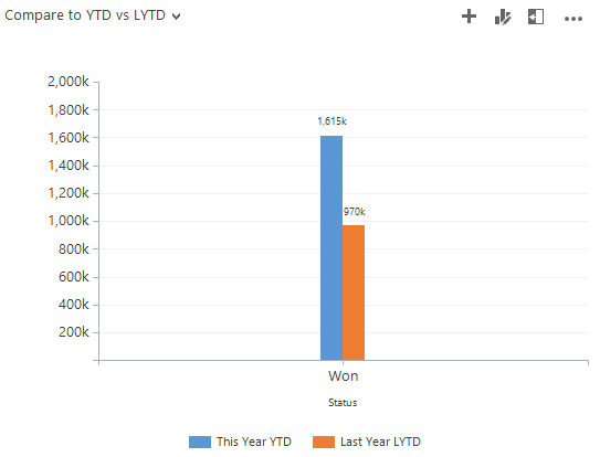
Comparing sales performance this period vs. the same period last year is a fairly standard metric. However, to create a chart that compares the period this year, with last years in the same date range can be tricky. For example, today is June 21st. I want to see my actual sales for this year to date, compared to my actual sales last year, until June 21st. Or Year to Date vs. Last Year to Date (YTD vs. LYTD).
Or maybe I want to compare my sales this year and last year by month.
In this post I will detail how I created both of these charts.
Compare YTD to LYTD in MS Dynamics CRM
Before I start to create the chart, I need to get some components ready first.
These are:
- View of Won Opportunities – This and Last Year
- Fetchxml filter for YTD
- Fetchxml filter for LYTD
Create the View for the chart
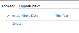
Open Advanced Find on opportunities and create the following view:
Name it “Won Opportunities: This And Last Year.” Always use this view with the charts in this post.
After saving it, keep Advanced Find open and use it to create the fetchxml filters we need to modify the chart xml with.
Create the following filters and download the fetchxml. You can download the fetchxml without saving the View first.
Filter for YTD
Filter for LYTD
Using the Older Than X Years will make sure we only get the LYTD date range for the won opportunities.
Note: Are you on a version earlier than CRM2015, you can use “Older Than X Months”, with X being 12, and get the same result.
Chart Editor
Time to open up the chart editor.
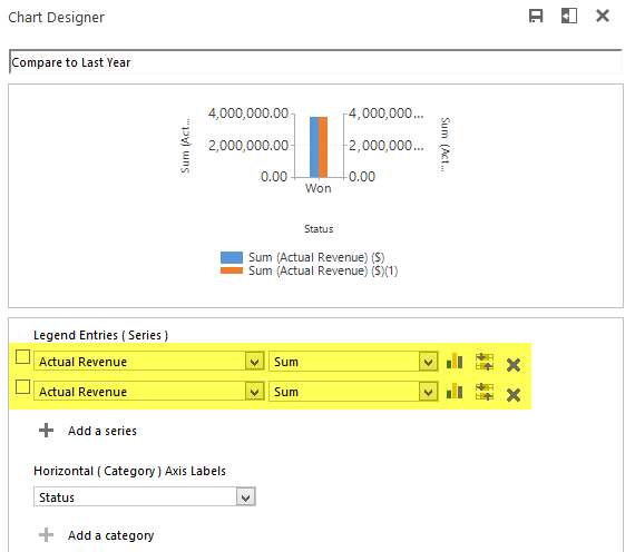
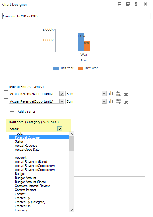
Save a chart similar to the settings here.
The two series for actual revenue, is what will be modified to YTD and LYTD using the filters we just downloaded from Advanced Find.
Now the chart xml is ready to export and we can have some fun!
Fetchxml edits
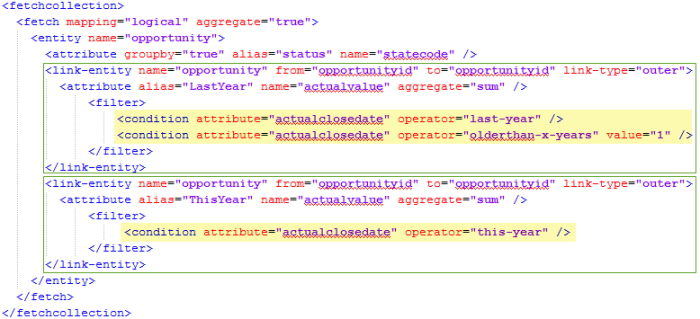
The two attributes for the actual value series will need to be edited so they use the filters we just downloaded.
Here is the fetchcollection with the additions made and the filters downloaded from Advanced Find highlighted in yellow.
Fetchcollection edits:
- Created link-entity outer joins so the series only includes the filtered data.
- Added the YTD and LYTD filters downloaded from Advanced Find.
- Renamed the aliases from _CRMAutoGen_aggregate_column_Num_0 or similar to more sensible names.
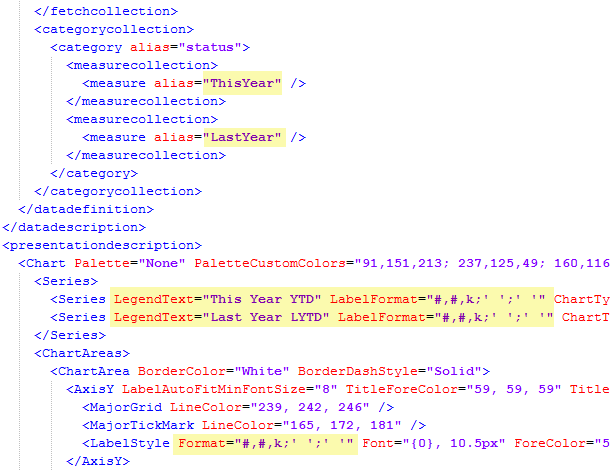
- If renaming the aliases, remember to update them in the categorycollection too.
Other changes:
- Make sure the series are in the same order in both the categorycollection and in the series section
- Custom LegendText
- Custom LabelFormat
- Format the Y axis numbers
The categorycollection is where you can adjust if YTD or LYTD should come first. In this example YTD comes first.
The new formatting is designed to show amounts in the thousands with negative and zero values suppressed. See this post for details on chart labels and formatting.
Import the XML and this should be your result.
Here is the chart and we can see how our performance is compared to the same period last year.
If you would like to see the data grouped by something else, such as customer or owner, you can open the editor and change the category.
Just keep in mind that if you make any changes to the legend entries you will lose your xml customizations.
Compare to Last Year by Month
For better insights on our sales development, we can group the sales by month instead.
Start with the chart we just made and use the editor to change the groupby to Actual Close Date and Month.
Click Save As and save the chart under a different name.
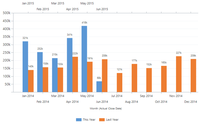
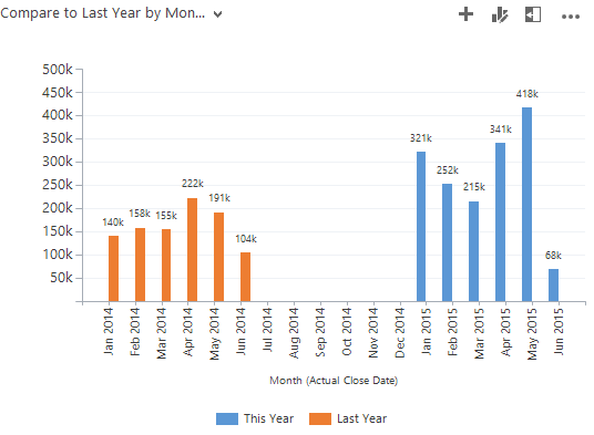
The result should look like this.
Now we see the same data spread out per month instead. What I would like to do is include all of last years data and then have the month columns next to each other, so March of this year is next March of last year, etc.
In short, what I will do is remove the Older-Than-1-Year filter so we get all of last year. Next I will split the data onto two separate X axes. One for each year and set the chart to display them in sync with each other so the months line up.
Note: We are working with data by month. If data points are missing for a certain month, that month will not be included. For this chart, we are relying on having 12 data points for each year. If you do not have a data point for each of the past months, then use dummy records to ensure a data point exists for the missing months. These can be of zero value and will not interfere with the calculations. You do not need records for future months.
Update filter and add secondary X axis
Export the chart xml.
First remove the “older than” clause in the fetchcollection.
Now scroll down and add the secondary X axis. Both in the Series and Axis section.
I added XAxisType=”Secondary” to the series for this year to indicate which series should go on the secondary X axis.
The AxisX2 section is identical to AxisX except for the “2” so you can copy it and add the number.
Import the chart xml back into MS Dynamics CRM.
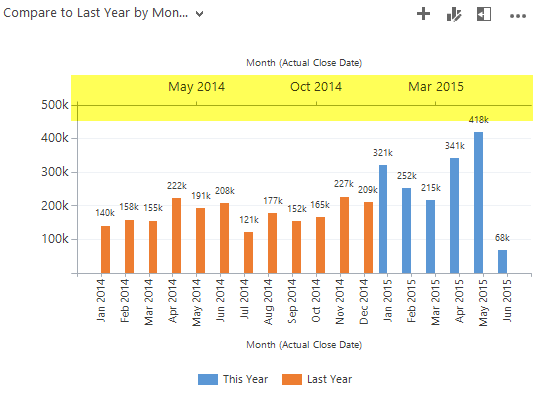
Notice that the secondary X axis has been added to the top of the chart. The blue columns are actually bound to the top (secondary axis) and the orange are on the bottom axis.
Overlap axes
Next step is to make the two axes overlap so it is easy to compare a month this year, to the same month last year.
We have 24 data points. One for each month of the two years. The series for last year is displayed on Axis 1 and should show points 0 – 12 (Jan-Dec of 2014). Axis 2 has the data for this year and should show points 12-24 (Jan-Dec of 2015).
To achieve that, I add Minimum and Maximum values to each axis so they are aligned.
Here are the chart xml axis edits.
IntervalOffset=”1″ is added so the axis does not show the zero value (i.e. Dec 2014 on the 2015 axis).
Interval=”1″ is added to make the intervals consistent between the two axes and show every month.
Notice the maximums are set to 12.5 and 24.5. That is to make sure the data for the last month is displayed in full. If set to 12 and 24 only half the column would display.
Import the xml and this should be the final result.
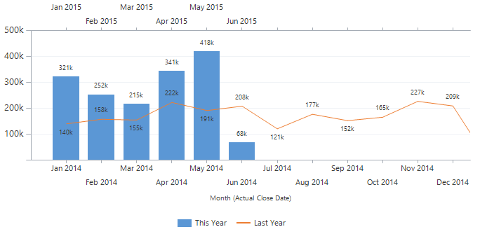
The chart type on Last Year can be changed to Line, ChartType=”Line”, to get this result.
As always, hope you enjoyed the post and found something useful. Please follow me on Twitter Follow @crmchartguy or sign up for the newsletter to be alerted on new posts.







Thank you for this great post. And for taking the time to work out great charts – and share your work.
Already looking forward to adding this to my dashboard.
Great job and thanks for sharing it!
Excellent post – charts are always better with some extra context, so showing this year’s results against last year’s is brilliant.
You could of course substitute This Year / Last Year with This Fiscal Year / Last Fiscal Year for exactly the same sort of result for those working with a non-January year (April is a common starting point in the UK for example, to coincide with the start of the tax year). The “Older than X years” with X=1 remains the same in this model.
You could of course also hide the X2 axis by using transparent colours for text, lines and tick marks to clean up the finished version. It ought to be possible to find a suitable “number” format to get the first X axis to show month names only. I need to do some testing to see if it responds properly to standard formats.
Another approach would of course be to use Goals as the underlying entity, then use the same sort of techniques to show last year and this year by filtering based on the start date of the goal period. It might be easier to use an option set for the months in order to get nice labels on the X axis, and you would not need a secondary axis if you do this. Because Goals are pre-calculated the performance should be better – charting up to 24 values maximum rather then aggregating hundreds or thousands of Opportunity values on the fly.
Thanks for the input Adam. For unknown reasons MS CRM does not support date formatting. Otherwise Format=”MMM” would have worked. That’s why I left both axes in there so you could see the year. It did work very briefly in one version of CRM2013, but suddenly disappeared again.
Not surprised to find formatting does not work, especially on the axis since CRM does not do proper date axes, they are all treated as categories, so it will skip months with no data, as you point out.
I’m trying to get this to work with Monthly Goals, Custom Period. Did you do this and have any luck? I’m filtering by the From to get the Month. It’s not coming together correctly.
Haven’t tried with goals, but sounds like that should work. From is a date field on Goals, so should be fine.
It’s fine until I add the second XAxis then the data doesn’t show up right. All the code is same as for Optys. It’s just that the chart doesn’t show the same, so I was wondering if it was due to the date field not being one date like in the Opty filter?
Thank you for your post.
How is it possible to compare the year-to-date performance for more than one year in the past? Lets say, “until 24.6.” of the last 5 years? Without problems this can be done for the last year, but how can I display this with out of the box filters in views or xml coding?
Thank you.
[…] Compare This Year to Last Year with a Dynamics CRM chart […]
[…] Compare This Year to Last Year with a Dynamics CRM chart […]
I just tried to copy these two charts. Thanks for pointing out the need for dummy datapoints to get the charts to show up correctly.
I come up short on one point – how do you get rid of the secondary Y Axis? Deleting it in the XML does not seem to be the right option. It stays – and the color of the whole grid changes.
If you could post the code (or mail it to me) so I don’t have to type off screenshots I would really appreciate it.
Sounds like you just missed deleting the secondary Y axis reference in one of the series. YAxisType=”Secondary”
Ta daaaaa http://screencast.com/t/UoqkIxVnHB
Secondary reference deleted – more dummy points for 2015 added and then I just “created” a really cool CRM chart. (or… you created it and I just copied your work.) You are welcome to swing by the office for coffee, cake, eternal gratitude and a CRM chat if you ever come to Denmark.
I’m still amazed by your creativity. Thank you. I’ve used your coaching for maybe 20 charts and they look brilliant… AND are adding value in our org. One issue I am having is a combined Bar/Line chart with two axis. I need to scale both axis to the same max number. Any recommendation?
@Nicholas if you have two axes but you want them to show exactly the same scale, why would you need two axes at all? Can’t you just plot everything on a single axis by getting rid of the YAxisType=”Secondary” (and optionally, getting rid of the YAxis2 definition completely).
An alternative, if you feel you want two axes, perhaps to have explanatory labels on them, for example “Actual Sales” and “Targets”, is to plot both series on both axes, but make the second version of them transparent. This way both axes will have a max that is large enough to contain its own series and the opposing one.
Man, I love this guy!!! Adam, you make this part of my life so easy. Thank you. Exactly what I wanted happen.
Thank you ! You saved my day !
This is just great 🙂
Is it possible to have two different date fields on either axis? I don’t really know how to Change the Attribute Group by so that I can compare order entry Dates with plan Dates (two customized fields). Thanks a lot.
Hi,
I keep getting this error message whenever I try to import the xml file into crm.
“The specified XML file “Compare To Last Year.xml” is either not valid XML or does not conform to the chart schema”.
Would you be able to help me resolve this error or post the full source code so I can see where abouts I have gone wrong.
Regards,
Daryl
I used this approach for both 2013 and 2015 environments, and I think also also 2011. So it should work. I’d recommend going through the steps from the beginning and do an upload between each edit to identify which component is causing the issues. That error could be something as simple as a missing < or " or a word property that is not capitalized correctly.
Hi
I was so excited to try this chart out for my companies CRM but like Daryl am also getting the error:
“The specified XML file “Compare to Last Year Chart.xml” is either not valid XML or does not conform to the chart schema”
Does the code work in Dynamics 2013? Xml is completely new to me, so maybe I got something wrong, but have checked and re-checked the code.
Thanks
Kathy
I used this approach for both 2013 and 2015 environments, and I think also also 2011. So it should work. I’d recommend going through the steps from the beginning and do an upload between each edit to identify which component is causing the issues. That error could be something as simple as a missing < or " or a word property that is not capitalized correctly.
I had received the same error in the beginning and I believe it might have been because I was copying and pasting my coding from one application to another (Notepad to Notepad ++). When I opened it up directly in Notepad++ to make my edits I did not receive the error when I tried to import it again.
I attempted this with the incident entity and ended up getting two columns with the exact same data. What could I have done wrong?
You probably just need to replace your “count” aggregate with “countcolumn”.
That was the issue! Thanks!
Seconded! Same issue as well and this was the fix.
Best,
This is amazing – and I have created charts with no major hickups. However – would it be possible to add a total column at the end the chart?
Excellent stuff. I’ve only been working with CRM charts and XML for a matter of days but I was able to follow the steps above and replicate the chart shown against our active Orders across the whole business. Cheers!
Thank you for the posts, really great. It expands the standard reporting possibilities via GUI a lot.
Incredible post. I’m so close, but weirdly I get the december 2015 bar repeating at the start of the chart. Could really use your help!
{70A5006C-0FDD-E511-80E0-6C3BE5A8E644}
Jobs ordered year over year
new_job
false
I figured out that my filtering isn’t working. Weirdly both the This Year and Last Year series show data for all month from Jan 2015 – April 2016. Any chance you can help me find the issue?
Did you ever get a reply on this issue? I am having the same problem with my chart.
Another brilliant solution. Two things I want as enhancements or polish.
1. Both vertical axis must be scaled the same so the visual compares are acceptable. Right now, the difference in axis make the compares more favorable than in reality.
2. I wrapped the X axis titles but would really like to suppress the year and only show the month.
Thanks again for your thought leadership.
Thanks for this post, I have a case that I need to display the records that have DateX greater than DateY.
How can I do that?
Thanks for your help
This is a great graph, thank you!
I would like to do something similar where I show OPEN forecasted opportunities as well CLOSED opportunities (current month) in 1 graph. Do you know if Dynamics CRM can render a graph that displays the est. close date on the bottom x-axis and the act. close date as the top x-axis? At the same time, I want to show the est. revenue amount on 1 y-axis and the actual revenue on the other y-axis.
Does this only work with amount? I mean i want to compare the number of emails received and compare them this year/ last year, it doesn’t seem to work.
It shows a value of 0 next to the month’s…
If you are trying to do a count of something which is filtered, make sure to use the aggregate method “countcolumn”. usually, a regular count will give you all the records, instead of the filtered set. If you are seeing 0 instead, something else is wrong.
I’m testing out this technique and have a count of contacts where createdon is in this year and last year.
When using count, I get a total of 9872 on both bars, which is the correct total number of contacts for the whole period that I get when exporting the underlying view.
When using countcolumn as advised in the article, I’m getting:
– This Year: 707
– Last Year: 7378
This does not total 9872. Not even nearly. I’ve pivoted the data in Excel and the split should be:
– Last Year: 1093
– This Year: 8779
Which is correct as it does in fact total 9872. Can you enlighten me on what is going wrong here?
Hi Luke, thanks for reading.
First I’d normally check that the field you are using does in fact have a value for all the records. Otherwise countcolumn would exclude them, but with createdon that should not be an issue. May wanna give contactid a try though.
Otherwise some of the dates could be outside the periods defined in the fetchxml. Have you tried running similar filters in Advanced Find to see what results you get there. If the numbers there don’t match what you get in the chart, then the issue is probably in the fetch section of the chart.
Hi Again,
Many thanks for coming back to me so quickly. I’ve resolved the issue after realising that I needed to link to a separate entity which contains my filter attributes.
My company has recently migrated to Dynamics and there is no data for several months in 2015. You mention to add dummy records with 0 values but as my chart is based on counts, I’m not sure of the best way to achieve this. Also, I’m dubious about introducing redundant records to overcome CRM’s shortcomings. Is there any other way around this? Would the technique described in your earlier article ‘include-records-with-no-value-in-charts’ be an option here?
Also, just to say, thank you for all your helpful insights. Which resources have you utilised to gain your excellent knowledge here? I’m struggling to find any decent documentation from Microsoft regards CRM charting and I get the impression that they’ve bolted this functionality on as a sales feature but not bothered to design it properly.
I’m tasked with training my end users on Advanced Find and charts and to expect them to be able to edit XML to do things as basic as amending a legend or axes title is ludicrous. Most of them have no clue what XML even is! : (
Thanks,
Luke
Sorry to keep bothering you but I also have a problem with the data bars overlapping each other for some months as well. I’m guessing this may be because I’ve had to play around with the Minimum and Maximum attribute values on both X Axes in order to get the months ticks to display properly. Any suggestions?
Thank you. Everywhere I look for information on customizing charts in CRM 2016 I come across your site. At first I thought I would never be able to get familiar with customizing charts by editing its xml file. Your post has made is so easy to follow.
Thank you much!!!!
Thank you for your site. While trying to create a similar report when I attempt to place different filter criteria on each attribute it returns that there is no data to graph. When I remove the filter from one of either of the two attributes it will graph the correct results of the filter I left but it applies the filter to both series instead of just one. I tried changing the count to countcolumn and still received the same results. Any ideas on what could cause this?
Sample code (second filter is same structure):
Thank you
Did you resolve this? I am having the same trouble and can’t get it figured out. Seems to be related to the Link-Entity line, but I’m not smart enough to know what it should be.
would it be possible to add another series to the diagram so that i can create a stacked Chart e.g. for different product Groups to show their share off the total Revenue?
I would think so. I haven’t actually tried it, but I don’t see why not. You’ll need an additional series for each product group though. So each group will need two series, one for each year, and you can have a max of 9 series.
Hi, I’ve created the new chart, but would like it to become the Default Chart on one of the views on my opportunity dashboard. Could someone please tell me how to do this?
Never mind I found it! 🙂
Everything worked and showed as it should until I got to the adding Min and Max, the last step. Once I do that, no data shows. There are data points for each month in the future. Any thoughts? I retyped XML, just in case.
I found the error. Working as should!!! Thanks for all your awesome work!
Hi thanks for the post. I’ve been trying to create a chart that is similar to this but rather than doing Jan to Dec I want to compare current fiscal year and las fiscal year the last part of your post (overlap axes) is not working. Could you tell me how to do the chart for FY. thanks
I’m so close to getting this chart perfect, can someone help I can’t get the months to line up on both axes.
I get both January 2016 and 2017 on the bottom x axes and then Feb 2017 (secondary x axes) is lined up with Jan 2016. What am I doing wrong?
thanks
Josee
Hi Josee,
You have to make sure there is data for Jan 2017, even if it’s an opportunity that is closed out with $0 as the actual revenue amount.
Hi Paul thanks for your reply, I do have data for Jan 2017.
Hi Josee. If you have data for Jan 2017, but your series starts with Feb 2017, then it is likely your fetchxml that may need some adjustment. Make sure the fetch part for this year actually includes the data you are expecting.
Love this chart and working perfectly. Client now has request to Add line static line for Monthly Quota. Would I be able to pull this in from the Goals?
It all depends on how you have it setup. There’s an example of a static quota line in this post about 1/3 of the way down. https://crmchartguy.wordpress.com/ms-crm-chart-editor-and-xml-overview/
I created this chart for count of cases created per month and it has been working great for some mgt. dashboards. However, now that we are in May of this year, the chart is not error-ing out with “The Maximum record limit is exceeded. Reduce the number of records”.
I’m trying to think of a fix but would like some insight.. possibly only show the last 3 months and compare those months to last year’s? I don’t know if that would fix my record limit problem.
Sounds like you have more than 50k cases. Whatever you can do to get the view under that amount will help. The one thing you need to make sure is that the date ranges for this and last year have the same starting point. If you’ve been using a view that’s been showing all cases including the previous years as well, it might be sufficient to limit the view itself to just this year and last year.
True, the view used for chart is “Created on Last Year OR Created on This Year” and that returned more than 50k cases. I tried limiting the “This Year” filter criteria to Last 4 Months but now the LYTD is off by one month..Feb ’16 column that aligns with Feb ’17 column shows cases created in Jan 16 – not Feb 16.. Struggling to dynamically show the last 4 months in 2017 compared to those 4 months Last Year.
Thank you for quick response!
I attempted to utilize some of the functionality of this to create an average/max/min chart where I plot three series of each. The first three series are the averages and are column types and they show appropriately on the chart. Series four-six are point for max using triangle for the marker, and series seven-nine are point for min using square for the marker.
The chart displays, but series 4-6 and 7-9 all show up on top of the middle column. I was going to try and offset the X Axis until I found out there is no Tertiary and I’d need two more X, not just the Secondary. Is it possible to offset series points 4/6 left X pixels and 7/9 right X pixels and leave series points 5/8 where it is (centered)?
I’m trying to show the max/min point series on top of their corresponding average column series. If I could draw it here, it would be like this.
4 5 6
156 426 53
123 123 23
123 123 423
123 123 123
789 789 729
Thank you!
Hi Michael,
Interesting chart you have going. It’s always a little hard to tell from descriptions what might be the issue, but if you have a lot of points on top of each other when you’d rather have them side by side, then it sounds like your groupby property doesn’t break them out. If your groupby is “status” for example, all your point markers would fall into the same group. The columns can display side by side, so that one is a little more forgiving. Assuming I’m on the right track, check if you can change the groupby to something else that categorizes the data the way you want. You may also want to have a look at the Error Bar Chart as it has some of the features you are looking for. https://msdn.microsoft.com/en-us/library/dd456729.aspx
Thank you for the reply. I believe formatting on my attempt at drawing the chart doesn’t show clearly what I am trying to do.
Let’s say I am trying to do a column chart that shows multiple fields of max/avg/min values for some group of Accounts. I am grouping by the Account and my three value fields for max/avg/min are called digital, analog and unknown.
In my fetch mapping I have:
In my series I have something like:
<Series ChartType="Column" IsValueShownAsLabel="True" Font="{0}, 9.5px" LabelForeColor="59, 59, 59"
CustomProperties=”PointWidth=100, MinPixelPointWidth=100, MaxPixelPointWidth=100″>
Let’s say my values are:
Account {CompanyA, CompanyB}
analog {50, 75}
digital {100, 200}
unknown {50, 75}
analogmax {100, 150}
analogmin {25, 40}
digitalmax {200, 400}
digitalmin {50, 100}
unknownmax {100, 150}
unknownmin {15, 25}
For each company I want three sets of columns (which should show the average value for analog/digital/unknown). On top of each column I want the corresponding max and min pointers. So the analog column showing the average for CompanyA should have the pointers for analogmax and analogmin on top of it. The middle column for CompanyA is the digital average and I want the pointers for digitalmax and digitalmin on top of that middle column and the right column should be unknown (average) with unknown max and unknownmin pointers on top of that.
It should then repeat this for the three columns in CompanyB and so on if I have more than two. Since I am grouping on the Account it does show the three average columns the way I want them, but the max and min pointers all appear centered on the middle column (in this case digital).
I need a way to shift the analog max/min pointers to the left on top of the analog (average) column and shift the unknown max/min pointers to the right on top of the unknown (average) column while keeping the digital max/min pointers where they are on top of the digital (average) column.
Is this even possible? If I could post a picture it might make it easier, but I don’t see a way to do that in the comments. I looked at the Error Bar Chart, but I don’t believe it will show this appropriately.
I’m trying to create this graph to compare the “count” of records created by week. How would I account for a week that didn’t have data? For example, I have 0 records for Week 1 of 2016 but 12 in 2017. Therefore, the axis don’t line up. Obviously, I can’t create dummy records for 2016 (at least not that I’m aware of).
Hi, I’m having a bit of difficultly with one of the charts for telephone integration client. It shows the number of inbound and outbound calls per month. The problem is that the field outbound is Yes/No type of field so the legend is a bit confusing. You need to hover over one of the color attributes to see which one is “Yes” and which one is “No”.
I would like to sort this chart so that legend shows clearly “Outbound” and “Inbound”.
Any idea how could I do that?
here is the screenshot of actual chart: http://imgur.com/OxrcBGA
Hi there,
I’ve got a request from my organization to show quotes created within the last 4 weeks by week, and to have a comparison to the same 4-week period last year. Is there a way to do this? Since this will be a rolling value, I’ve got the filter set for “Last X Weeks = 4” for the current year. However, I can’t figure out how to do this dynamically for the same window last year. Any help would be appreciated.
Thank you!
@brianna Have you tried Last X weeks: 56 AND Older than X weeks: 52? You will need to bear in mind that “Last X weeks / months / years” does not include the current one. If you really want the last 28 days, then use Last X days, but even that does not include today (you can do an OR with “Today” so they get counted, but there is no real equivalent for the same period a year ago to get the half a day of this date last year).
Thank you! 🙂
Hello, I want to compare 3 different fields on the same chart, so 3 pairs of this year vs last year, 6 bars total. I am almost there, but the last bar shows $0. I check my view and the field is there and it should calculate the sum but it’s still showing as zero. I am not sure which part of my code is the culprit. Any help would be appreciated.
Gosh, silly mistake….my operator was this-year instead of last-year for the LYTD series. It’s good now!
The chart is perfect! But I have a little problem…
if I change the view with an identical one by adding the owner filter, the overlap messed up getting the following result :
Any suggestion to fix this?
Thanks you!
Below is my code but I am not able to get the desired output: This year data is not visible in the chart.
{5B85152A-5900-E811-8172-E0071B675C91}
Compare to Last Year by Month Overlap-Copy(1)-Copy(4)
opportunity
false
This year data is not visible in my chart.
I think this was asked above, but I didn’t see an answer. I have the chart working perfectly for This Year vs Last Year.
Now, the powers that be would like to include Current Year vs Last Two Years. Is there a way to do this?
{1E50CA39-0400-E811-815F-E0071B662BF1}
Compare to Last Years-Copy(1)-Copy(1)
opportunity
false
What’s wrong in this code? I m not able to see this year data.
Hey Chart Guy, your posts are so awesome. They have saved my bacon many times when trying to customize charts. Hoping you can help me here.
I have a Goals by Month chart where the Target (money) is a column and the Actual (money) is a line. The Actual line past the month with any data in it is extending with a value greater than zero. Is there a way to push the actual line down to zero when there isn’t any data?
Here is the XML for this chart.
{DC7B38E2-C2FB-E711-8104-3863BB35CC58}
Goals by Month
1-2018 dashboard updates
goal
false
I noticed my XML didn’t transfer – trying again…,
{DC7B38E2-C2FB-E711-8104-3863BB35CC58}
Goals by Month
1-2018 dashboard updates
goal
false
Hi Nina. Sorry, but WordPress blocks adding fetchxml to the forum unfortunately. If you have a onedrive you could temporarily share a link to it, and a screenshot would be nice too.
Here is the link to my OneDrive, again, thank you in advance.
https://comfortsystemsusa-my.sharepoint.com/:f:/p/nina_nuckols/EkAq9YRCyShLpI9yfLyaN-kBMyW6wUPAJwCl3ZxxFSMyPQ?e=dRhhQP
It does not work when I try to do the same for Cases.
My requirement:-
Display the count of cases opened in each month. On the “X” axis, display each of the 12 months of the year. Each month should display two vertical bars. One for last year and one for the current year The “Y” axis displays the count of cases created.
I tried using the instructions in the post and created the same. But in both vertical bars (Y axis) it shows the same data. I created the same (just to check If I was making a mistake) for opportunities and it worked.
Hi Rizwan. You may be using “count” instead of “countcolumn” in your aggregate. That would cause that behavior.
I think I’ve never seen a blog post about Dynamics CRM with this many comments… awesome charting tip!
Awesome post! Additionally, showing the % difference of the variance (LYTD-YTD-)/YTD requires SSRS or Power BI? Or, is there a way to accomplish this without those tools? Maybe the xrmtoolbox chart tools?
Sorry, typos!
Awesome post! Additionally, showing the % difference of the variance (LYTD-YTD)/LYTD requires SSRS or Power BI? Or, is there a way to accomplish this without those tools? Maybe the xrmtoolbox chart tools?
Hi,
Followed the instructions, I get nothing but errors when attempting to import. Have no idea what I am doing wrong.
“The specified XML file “Charttest.xml” is either not valid XML or does not conform to the chart schema”
any advice??
Thank you,
Joe
Figured it Out!! I was working with a custom entity so I needed to figure out the right names of the fields. Great instructions and very resourceful.
Hi Joseph
That error could be something as trivial as a missing bracket or an incorrectly capitalized property. In this case I’d recommend uploading your chart after every modification. Then you can see exactly what change caused the error.
Any answers to some mentions above about why this year data isn’t visible when the overlay is applied?
Are there any other ways to achieve this? Maybe through the xmrtoolbox or a Dynamics apps?
With the XrmToolBox you can use a combination of the Advanced Chart Editor and the FetchXML Builder. You would still have to go through all the same steps, but you have the interface assist you along the way. That’s really the only other way to achieve this with the built-in chart.
Alright! Thanks Ulrik for your awesome blog !