Comparing sales performance this period vs. the same period last year is a fairly standard metric. However, to create a chart that compares the period this year, with last years in the same date range can be tricky. For example, today is June 21st. I want to see my actual sales for this year to date, compared to my actual sales last year, until June 21st. Or Year to Date vs. Last Year to Date (YTD vs. LYTD).
Or maybe I want to compare my sales this year and last year by month.
In this post I will detail how I created both of these charts.
Compare YTD to LYTD in MS Dynamics CRM
Before I start to create the chart, I need to get some components ready first.
These are:
- View of Won Opportunities – This and Last Year
- Fetchxml filter for YTD
- Fetchxml filter for LYTD
Create the View for the chart
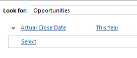
Open Advanced Find on opportunities and create the following view:
Name it “Won Opportunities: This And Last Year.” Always use this view with the charts in this post.
After saving it, keep Advanced Find open and use it to create the fetchxml filters we need to modify the chart xml with.
Create the following filters and download the fetchxml. You can download the fetchxml without saving the View first.
Filter for YTD
Filter for LYTD
Using the Older Than X Years will make sure we only get the LYTD date range for the won opportunities.
Note: Are you on a version earlier than CRM2015, you can use “Older Than X Months”, with X being 12, and get the same result.
Chart Editor
Time to open up the chart editor.
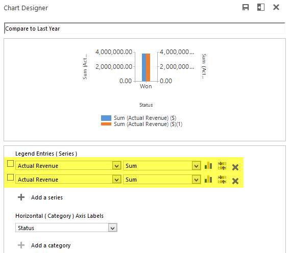
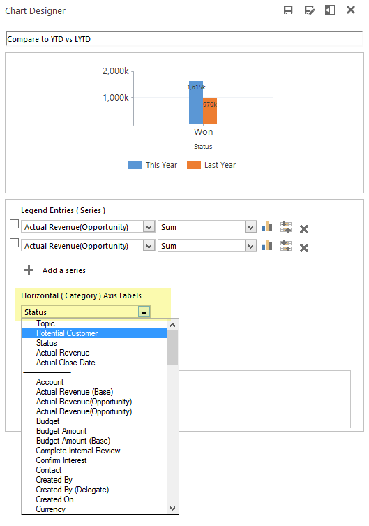
Save a chart similar to the settings here.
The two series for actual revenue, is what will be modified to YTD and LYTD using the filters we just downloaded from Advanced Find.
Now the chart xml is ready to export and we can have some fun!
Fetchxml edits
The two attributes for the actual value series will need to be edited so they use the filters we just downloaded.
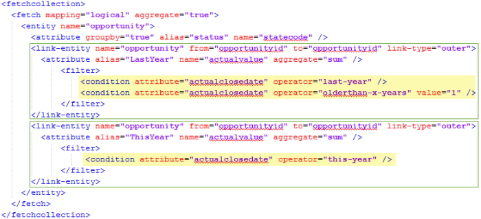
Here is the fetchcollection with the additions made and the filters downloaded from Advanced Find highlighted in yellow.
Fetchcollection edits:
- Created link-entity outer joins so the series only includes the filtered data.
- Added the YTD and LYTD filters downloaded from Advanced Find.
- Renamed the aliases from _CRMAutoGen_aggregate_column_Num_0 or similar to more sensible names.
- If renaming the aliases, remember to update them in the categorycollection too.
Other changes:
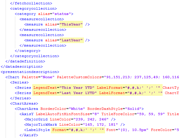
- Make sure the series are in the same order in both the categorycollection and in the series section
- Custom LegendText
- Custom LabelFormat
- Format the Y axis numbers
The categorycollection is where you can adjust if YTD or LYTD should come first. In this example YTD comes first.
The new formatting is designed to show amounts in the thousands with negative and zero values suppressed. See this post for details on chart labels and formatting.
Import the XML and this should be your result.
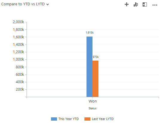
Here is the chart and we can see how our performance is compared to the same period last year.
If you would like to see the data grouped by something else, such as customer or owner, you can open the editor and change the category.
Just keep in mind that if you make any changes to the legend entries you will lose your xml customizations.
Compare to Last Year by Month
For better insights on our sales development, we can group the sales by month instead.
Start with the chart we just made and use the editor to change the groupby to Actual Close Date and Month.
Click Save As and save the chart under a different name.
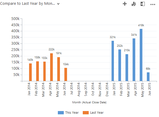
The result should look like this.
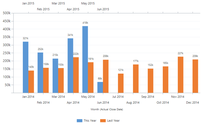
Now we see the same data spread out per month instead. What I would like to do is include all of last years data and then have the month columns next to each other, so March of this year is next March of last year, etc.
In short, what I will do is remove the Older-Than-1-Year filter so we get all of last year. Next I will split the data onto two separate X axes. One for each year and set the chart to display them in sync with each other so the months line up.
Note: We are working with data by month. If data points are missing for a certain month, that month will not be included. For this chart, we are relying on having 12 data points for each year. If you do not have a data point for each of the past months, then use dummy records to ensure a data point exists for the missing months. These can be of zero value and will not interfere with the calculations. You do not need records for future months.
Update filter and add secondary X axis
Export the chart xml.
First remove the “older than” clause in the fetchcollection.
Now scroll down and add the secondary X axis. Both in the Series and Axis section.
I added XAxisType=”Secondary” to the series for this year to indicate which series should go on the secondary X axis.
The AxisX2 section is identical to AxisX except for the “2” so you can copy it and add the number.
Import the chart xml back into MS Dynamics CRM.
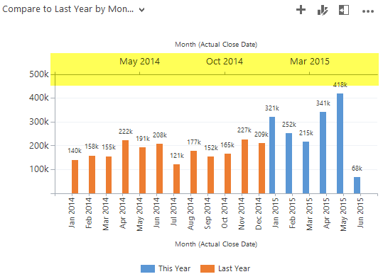
Notice that the secondary X axis has been added to the top of the chart. The blue columns are actually bound to the top (secondary axis) and the orange are on the bottom axis.
Overlap axes
Next step is to make the two axes overlap so it is easy to compare a month this year, to the same month last year.
We have 24 data points. One for each month of the two years. The series for last year is displayed on Axis 1 and should show points 0 – 12 (Jan-Dec of 2014). Axis 2 has the data for this year and should show points 12-24 (Jan-Dec of 2015).
To achieve that, I add Minimum and Maximum values to each axis so they are aligned.
Here are the chart xml axis edits.
IntervalOffset=”1″ is added so the axis does not show the zero value (i.e. Dec 2014 on the 2015 axis).
Interval=”1″ is added to make the intervals consistent between the two axes and show every month.
Notice the maximums are set to 12.5 and 24.5. That is to make sure the data for the last month is displayed in full. If set to 12 and 24 only half the column would display.
Import the xml and this should be the final result.
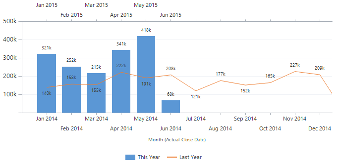
The chart type on Last Year can be changed to Line, ChartType=”Line”, to get this result.
As always, hope you enjoyed the post and found something useful. Please follow me on Twitter Follow @crmchartguy or sign up for the newsletter to be alerted on new posts.







Hi, this works great but my issue is that I have no data for Jan and Feb 2017, but i do for Jan and Feb 2018, so the months on the x and x2 axis labels are not aligned properly. I tried changing the min/max but cannot get it to show properly. Any help would be appreciated.
That’s a challenge with this chart. You do need data for each month. It is possible to create some dummy records with no value to even it out. I.e. an opportunity with 0 est. rev.
Thanks for the quick response! I will do that.
Hi Ulrik – can you help guide me to setting something like this up for counting the # of opportunities created per month for this year and last year? LYTD, YTD – is it similar?
Yes, it would be similar. I think you’d just need to use the countcolumn aggregate instead.
Hello – I have set up a chart to compare 2017 and 2018 annual spend by event category. My “last year” data is pulling the correct data. The data for “this year” is pulling numbers from both last year and this year? Would you have any idea why that would happen? I’ve tried modifying the filter conditions in the XML with no luck. Please let me know. Thanks.
Hello,
I’m just wondering if you had any luck with this issue as I’m seeing a similar problem. I can’t understand why the columns are pulling in records from both years.
Did you find a solution?
Thanks.
I’m having the same issue here. If anyone has a fix please share. I will share if I come up with something also.
Hi Ulrik,
Thank you for sharing the wealth of knowledge. You are an inspiration to the CRM community and a rare gem to the CRM world.
I did follow your Instructions and it was helpful in creating a chart that I needed. After overlapping X Axes, how to I change the name of the axis text (category name/axis labels). I did try using Format=”MMM” in the LabelStyle node and it did not work. Basically, I would like to keep the calendar months and remove the year.
I appreciate your kind help with this.
Thank you,
Jason
That type of formatting is not supported on an axis unfortunately. It would have been great.
Thanks for the quick response!
Hello Ulrik, thank you very much for your contribution to the CRM community!
I followed your steps and it works properly but I do have an issue with the second axis, both axes are not on the same level Axis 1 max is 160k while Axis 2 max is 100k so Axis 2 is above Axis one when in reality it is supposed to be the opposite. Anny thoughts ?
Hi Mat. consider adding a Max property to both axes. That way you can hard set both both axes at 160k. You lose some dynamic adjustment of the axes, but at least they will match.
Thank you very much 🙂
I tried doing the same thing to compare Quarters but I couldnt make it work, do you think it is possible ?
And I did it aswell to comprare This month to last year same month example March 2019 vs March 2018, it works but the final chart is not pretty to look, like X is getting over X2 when interval and such values are the same ?
Any idea ?
Hi Ulrik and thank you very much for your help!
I have one issue, Axis 1 max is 160k when the record is 140k and Axis 2 max is 100k when the record is 99k so axis 2 is above axis1 when it is supposed to be the opposite, any idea?
Mat
Hi Ulrik,
It is always fun to recreate the charts you talk about and customize them. We use the Recruit version of MS CRM, so there’s not always a direct correlation because we focus on enrollment numbers rather than revenue. But I recreated the month comparison with a count column aggregate and it is working great! Thanks so much!
Do you know if there would be a way to subtract canceled opportunities from a chart like this? I think if it wasn’t comparing to last year, I could use the second x axis reversed and underneath the first x axis to see students that canceled during that month. But I would need four x axes to do that here, right? Am I overthinking it? Can you think of any other way to subtract cancelled students from a chart of applicants, for instance?
Hello,
Is there any way we can create a chart for the 3 previous years i.e. one bar of the chart for 2018, another for 2017 and so on?
I don’t think so. The reason is we are splitting the years over two x-axes, and that is the most x-axes that is possible. So you couldn’t have three years side by side. Maybe you could have them in multiple charts.
Can this chart be done without fetchXML?
I tried recreating the steps but when importing I get “Not conformed to chart schema”.
Hi Kristoffer. Creating the different filtered series in FetchXML is a requirement for this to work. I’d recommend uploading your xml changes after every step to see where you are hitting the error.
Thanks, I have used FetchXML and used the code as per your instruction, but I STILL can’t get the import to our CRM to work. I have compared my code to your code a hundred times and can’t see any discrepancy. Please help me out! 😦
I have uploaded my files to https://gofile.io/?c=bOhzFs.
Hi, no assistance? =/
Hi,
I tried them on an UCI environment and the first one works great, but the “Compare to Last Year by Month” doesn’t work. Columns refuse to be next to each other…
Any idea to make it works ?
Thank you
Hi Julie. Unfortunately those properties are currently not supported by the Unified Interface, so there’s no current workaround. I believe it will only be possible if UCI starts supporting them.
Hi,
First of all, thanks for putting this up here. It’s given me a start to working out what I need to do.
I’ve had a go at this but for a slightly different application. I needed to compare the number of cases per month from last year to this year so where your chart is for a month on month sum for opportunities, I needed to have a month on month count for cases.
I’ve created my chart in CRM and exported it then done the changes mentioned above except I’ve changed all references from ‘opportunity’ to ‘incident’ as well as the linking field to ‘incidentid’. I’ve changed the ‘aggregate’ from ‘sum’ to ‘count’ and the ‘attribute’ from ‘actualclosedate’ to ‘createdon’. I’ve also removed the legend text and format for now.
However, when I look at my chart after I’ve imported it back in, I’m getting columns of exactly the same height which both contain mixed information. I’ve checked my filter criteria and aliases mulitple times and they appear correct but I’ve no idea what I’m doing wrong.
Can you think of something I may be missing here?
Yes, try countcolumn, instead of count. countcolumn only include records that has values, which is what you want in this case.
Hi Ulrik
Your posts are great and really easy to follow. I have followed your steps above but I’m getting an error…The specified field does not exist in Microsoft Dynamics 365. I can’t find what is causing it – can you help please?
Thanks.
Ulrik,
Thanks for this post. I used it back when I was on CRM version 8 (on-premise) and it worked great. I do a simple monthly compare on orders filtered by this fiscal year versus last fiscal year, by the month of the order date for my Category and a dollar amount field for my Series.
I have now migrated to D365 version 9 (cloud) and using the new unified apps.
I thought I could just export the chart from my on-premise and import it into my cloud environment. So I imported it and in the chart preview area for my dashboard it looks like it is going to work just fine. So I publish the customization
When I look at the graph on the actual published dashbard it’s not putting my months together and instead putting a $0 and then last years number and I’m also not seeing the secondary X axis at the top of the graph either.
Have you had a chance to experiment with the latest version of D365 if this blog pertains to that version or if there needs to be some possible changes?
thanks for any help!!
Hello Ulrik and happy new year !
I used your chart in 2019 and it was so useful, I am wondering if it was possible to make the same chart but with 3 years ?
I manage to do it for this year to last year to last last year chart, but I cannot find a way to make it work for the months chart. I can’t add a AxisX3 so I guess the problem is coming from there. Have you got any idea ?
Cheers !
[…] years ago, I wrote a blog post about how to create a chart that compared monthly sales, to the same month in the previous…. The approach required quite a bit of XML editing and the chart was limited to only comparing this […]
Hi, good afternoon. I did exactly like you said, but i think i did something wrong. For image and code (https://gofile.io/d/xxDdoN), could you say what’s wrong?
I tried with quotenumber.count of quote instead actualrevenue.sum.
Thanks for teaching us!!
[…] think that you can see this reference https://crmchartguy.com/2015/06/21/compare-this-year-to-last-year-with-a-dynamics-crm-chart/. I particularly used this reference in past and could have sucess on […]
Hello,
Thanks for your nice blog.
Your N/N-1 comparison works fine, but only with custom entities.
If I try to do this with the appointment entity for example (number of Appointments this year/last year), the filters are not taken into account.
is there any tip for that?
thanks 🙂
Best regards
Hi Jean-Baptiste. Appointments and other activities all go through the ActvitityParties entity. You can see some charting tips on that here https://crmchartguy.com/2016/01/16/charting-on-activity-parties-in-ms-dynamics-crm/ Also, whenever you are counting instead summing on a related entity, make sure you use “countcolumn” instead of “count” as the aggregate.
Hello Ulrik.
Thanks a lot. this was the issue. this was a big trap, because the fetchxml generated by Dynamics use “Count” aggregate.
Thanks again.
Hello Ulrich,
Thanks for your post.
I tried to compare 2 years by months as you did. It does not work in my D365 environnement : the Secondary X Axis does not appear, and I can’t overlap axis
This customization can’t br done i a D365 environment?
thanks for your help.
Jean-Baptiste.
Hi Ulrich,
I’m facing the same issue as Jean-Baptiste, it won’t accept the secondary X Axis 😦
Any idea if customisation is blocked with the newer release?
FYI : GREAT ARTICLE !!!
Regards,
Sven
Hi,
I also tried this one, but I wasn’t lucky. I try to compare last year data to this year. I followed above instructions, but I will get the message UNSUPPORTED condition operator: Here you can see my script:
{0842ef35-1870-eb11-a812-000d3a26e127}
Compare to Last Year by Month
null
opportunity
etc……
Thank you so much for these great posts. With the instructions here, I managed to build the chart.
I would like to add two additional lines for last year and for this year (YTD) to visualise the cumulative turnover trend:
Line 1 for last year: Aggregation of total turnover on a monthly basis. I.e. for January only the January turnover is shown. For February, the January turnover + the February turnover. For March, January turnover + February turnover + March turnover, etc. until end of year.
Line 2 for this year: Analogous to line 1 but only with YTD as the period.
Is something like this feasible? And if so, I would appreciate a tip on how to achieve this result.
Many greetings, Klaus